Readability
Why readability matters so much
Some charts are not wrong in a strict technical sense, but they still fail because they are exhausting to read. In those cases, the main problem is not missing information or visual dishonesty. The main problem is friction.
In this chapter, I focus on the choices that make a chart easier or harder to decode.
The rules I group under readability
- Rule 7. Readable labels and ticks
- Rule 8. Color accessibility
- Rule 9. Direct labeling
- Rule 10. Avoid chartjunk
- Rule 11. Too many categories
- Rule 12. Sort categorical bars
- Rule 13. Scatter overplotting
- Rule 14. Decimal precision
- Rule 15. Date axis formatting
- Rule 16. Visual economy
Rule 7: Readable labels and ticks
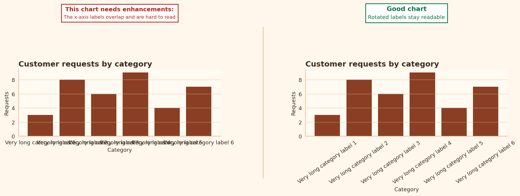
I do not want readers fighting the axis before they can even reach the data. Dense ticks, tiny type, and awkward label rotation all create unnecessary effort.
- If labels do not fit, the chart often needs simplification rather than more rotation.
- A readable axis is part of the chart’s logic, not an afterthought.
Rule 8: Color accessibility
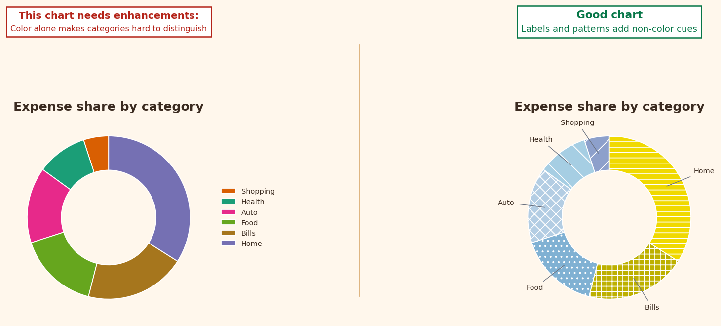
Color should help distinguish categories, not create another obstacle. If categories collapse into similar hues, the encoding stops doing its job.
- Too many colors reduce clarity.
- Similar hues can fail in projection, in print, or for colorblind readers.
Rule 9: Direct labeling
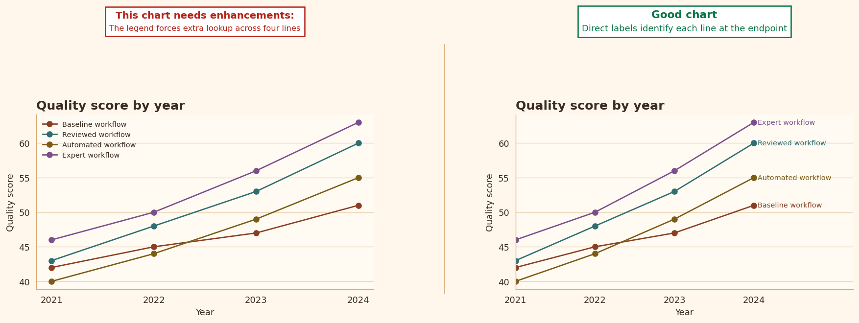
When a chart contains only a few lines, I often prefer labels placed directly next to the data instead of a detached legend. This reduces eye movement and keeps the reading path coherent.
- Direct labels work especially well when two to four lines are shown.
- They are often simpler and more elegant than sending the reader back and forth to a legend.
Rule 10: Avoid chartjunk
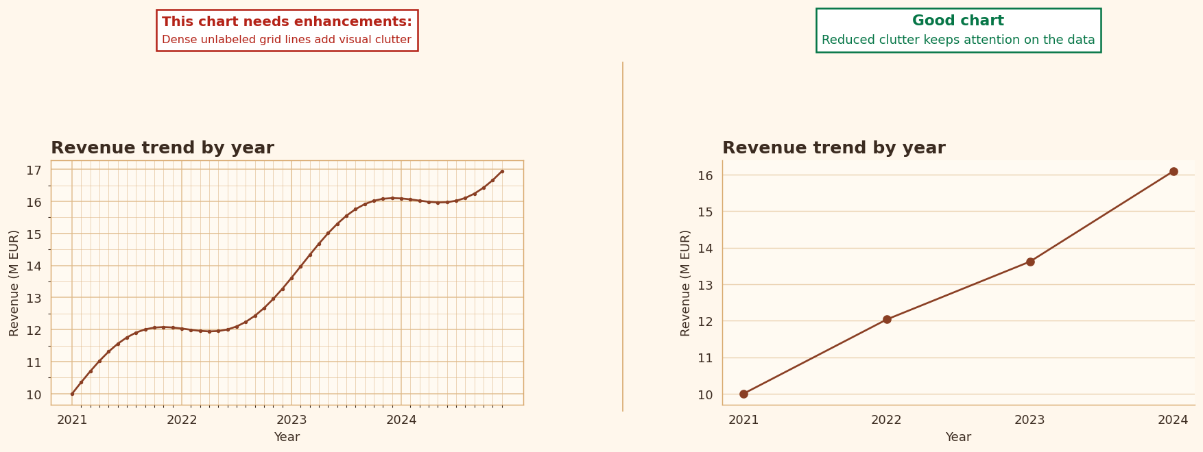
I want decoration to stay subordinate to information. 3D effects, heavy borders, excessive shading, and dense grids often create noise without adding understanding.
- In class, I ask whether each visible element helps a comparison or simply fills space.
- If it does not help the reader see something meaningful, it probably does not belong there.
Rule 11: Too many categories
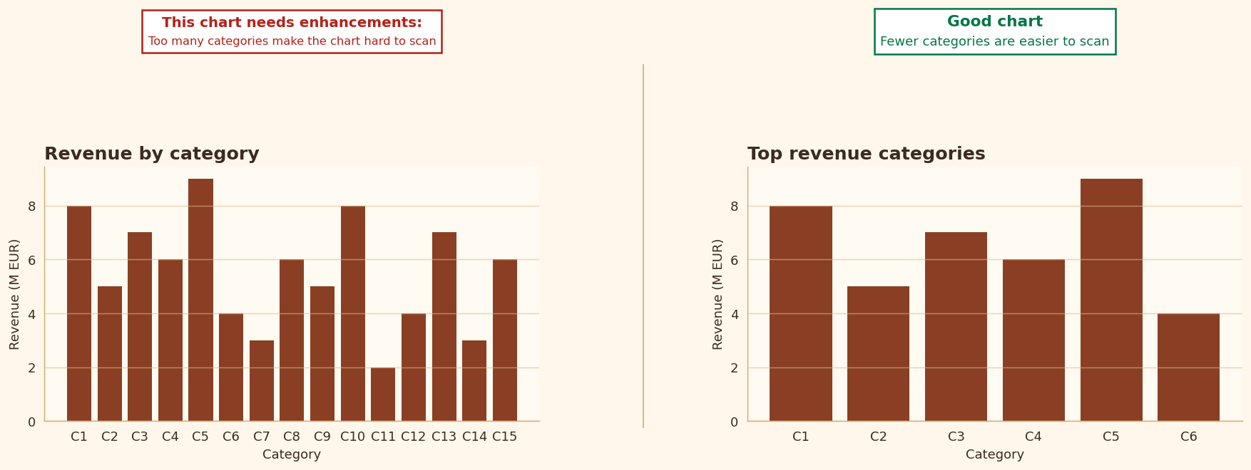
A category chart should remain scannable. Once the number of categories becomes too large, comparison turns into label decoding.
- At that point, aggregation, filtering, or faceting is often better than showing everything at once.
- I would rather show a smaller, more interpretable chart than a complete but unreadable one.
Rule 12: Sort categorical bars
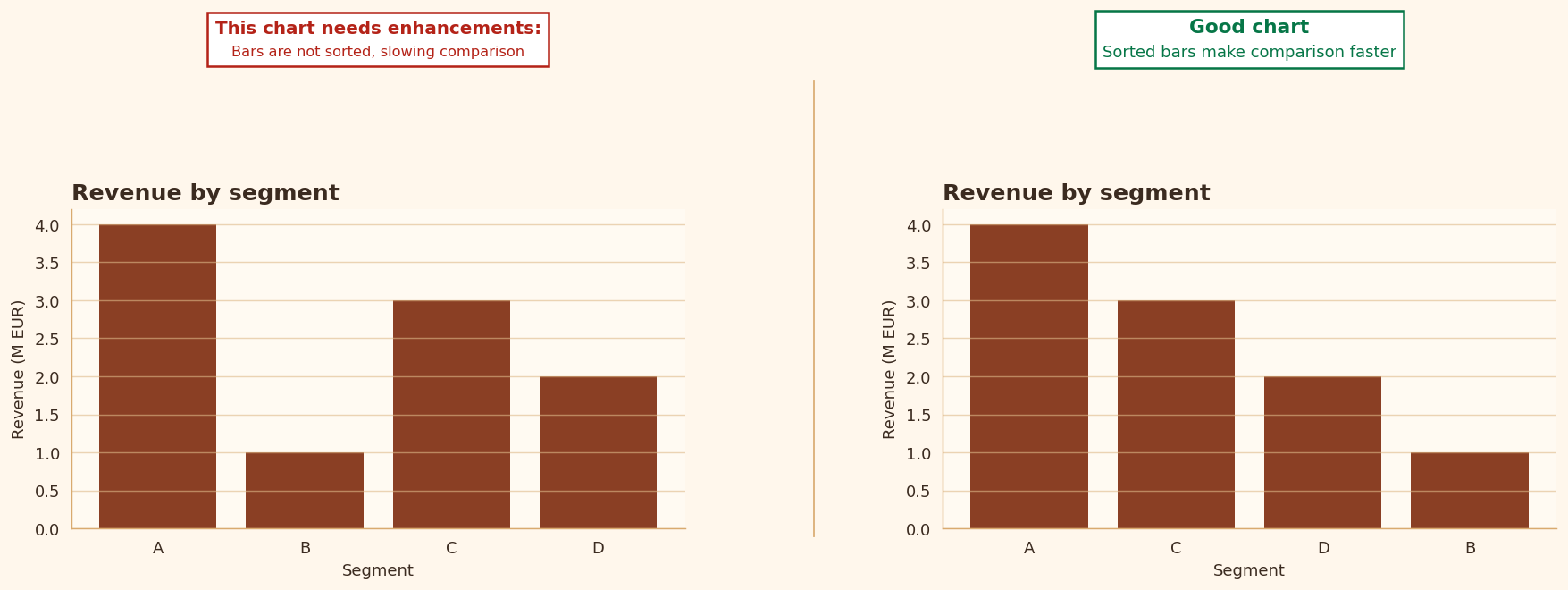
When categories have no natural order, sorting usually helps the reader compare them more efficiently. It makes extremes visible and reduces search effort.
- I generally prefer ordered bars unless a semantic order already exists.
- The point is not to beautify the chart, but to make comparison easier.
Rule 13: Scatter overplotting
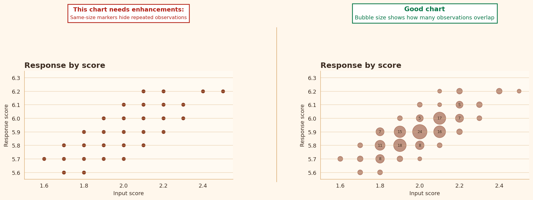
In dense scatter plots, too many points can hide the structure they are supposed to reveal. Overlap can conceal clusters, duplicates, and changes in density.
- This is where I introduce tools such as alpha, jitter, hexbin, or aggregation.
- A point cloud is only useful if the reader can still see the pattern.
Rule 14: Decimal precision
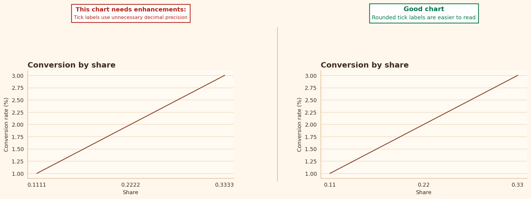
Too much numerical precision slows reading and can suggest a level of certainty that the chart does not really support.
- In most classroom examples, I do not need more than two decimals on an axis.
- Precision should match the decision, not the raw machine output.
Rule 15: Date axis formatting
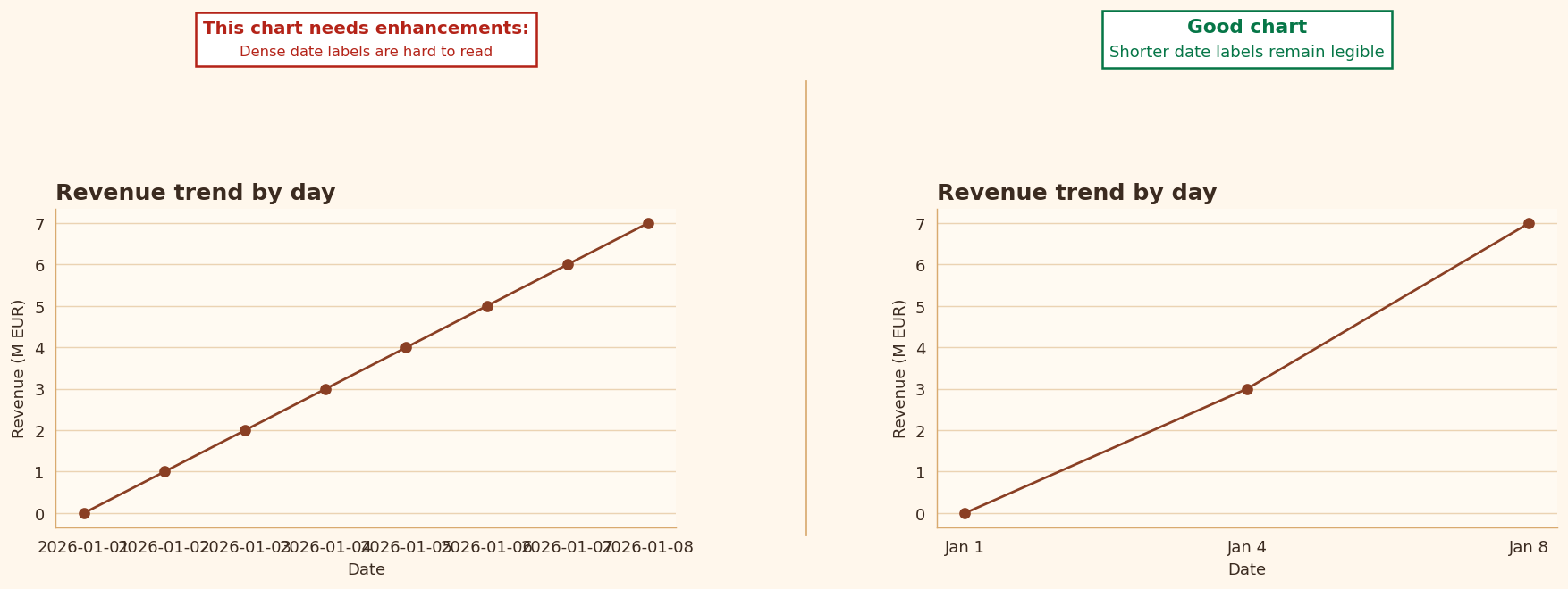
Time labels often become unreadable before students even notice the problem. Dates are especially prone to overcrowding.
- I usually start by reducing tick count.
- Then I shorten the date format.
- I use rotation only when simpler options are not enough.
Rule 16: Visual economy
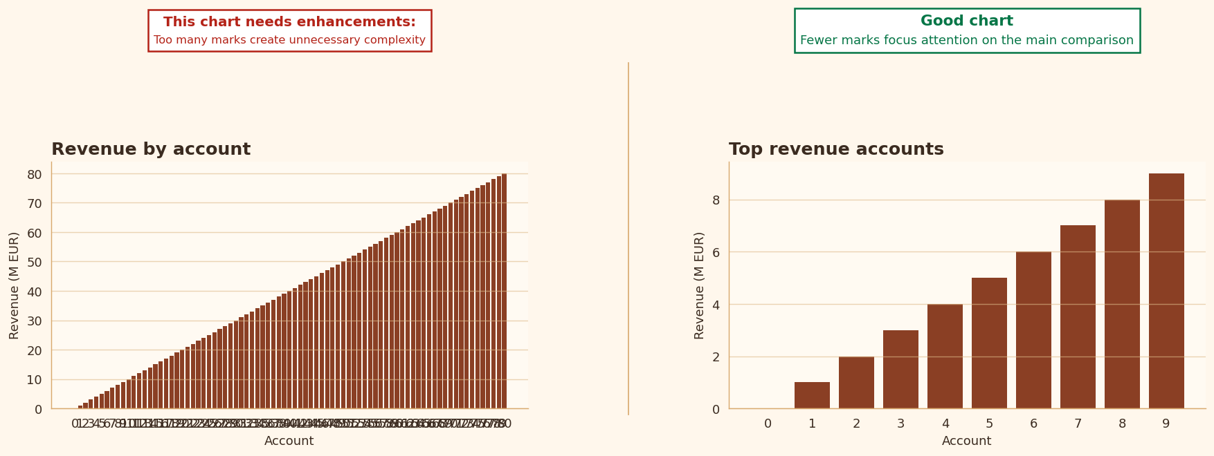
One of the most common beginner mistakes is trying to show too much at once. A chart does not become stronger by accumulating every possible detail.
- Too many visible elements dilute the main message.
- Very often, simplification is the most intelligent redesign move available.