Completeness
Why I begin with completeness
When a chart is incomplete, it fails before interpretation even begins. If I cannot tell what is being measured, for whom, in which unit, or under what conditions, then the chart is already in trouble. That is why I start here.
In this chapter, we look at the rules that make a chart understandable before we even start debating whether it is elegant or persuasive.
The rules I group under completeness
- Rule 1. Clear title
- Rule 2. Axis labels
- Rule 3. Units and scale clarity
- Rule 4. Legend clarity
- Rule 5. Annotation context
- Rule 6. Uncertainty cues
Rule 1: Clear title
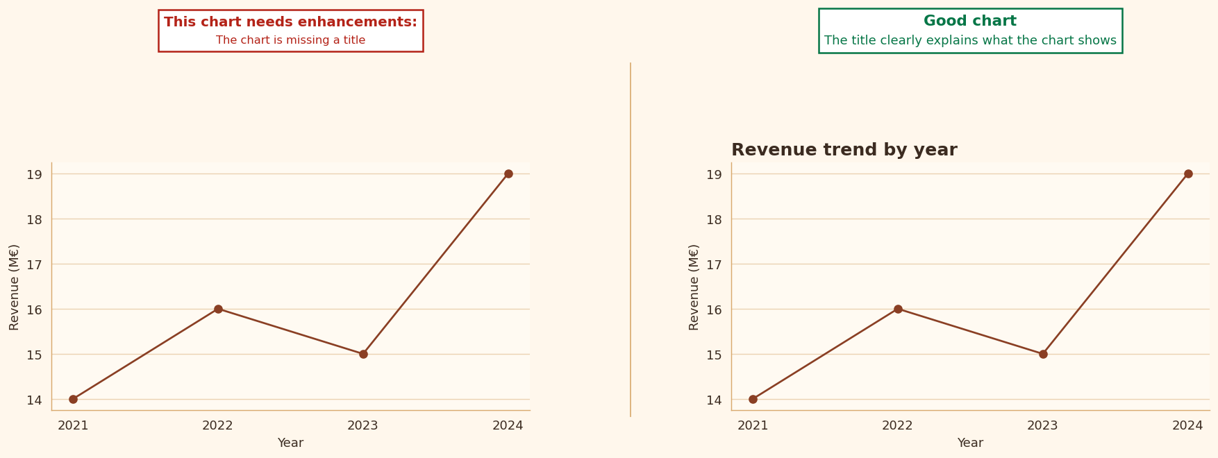
When I see a vague or generic title, I immediately know that the chart is asking the reader to do extra interpretive work. A good title should not merely name a topic. It should help frame what the chart is about.
- I ask students to specify what is measured, for whom, and over what period.
- Titles such as
SalesorPerformanceare usually too weak to do real explanatory work.
Rule 2: Axis labels
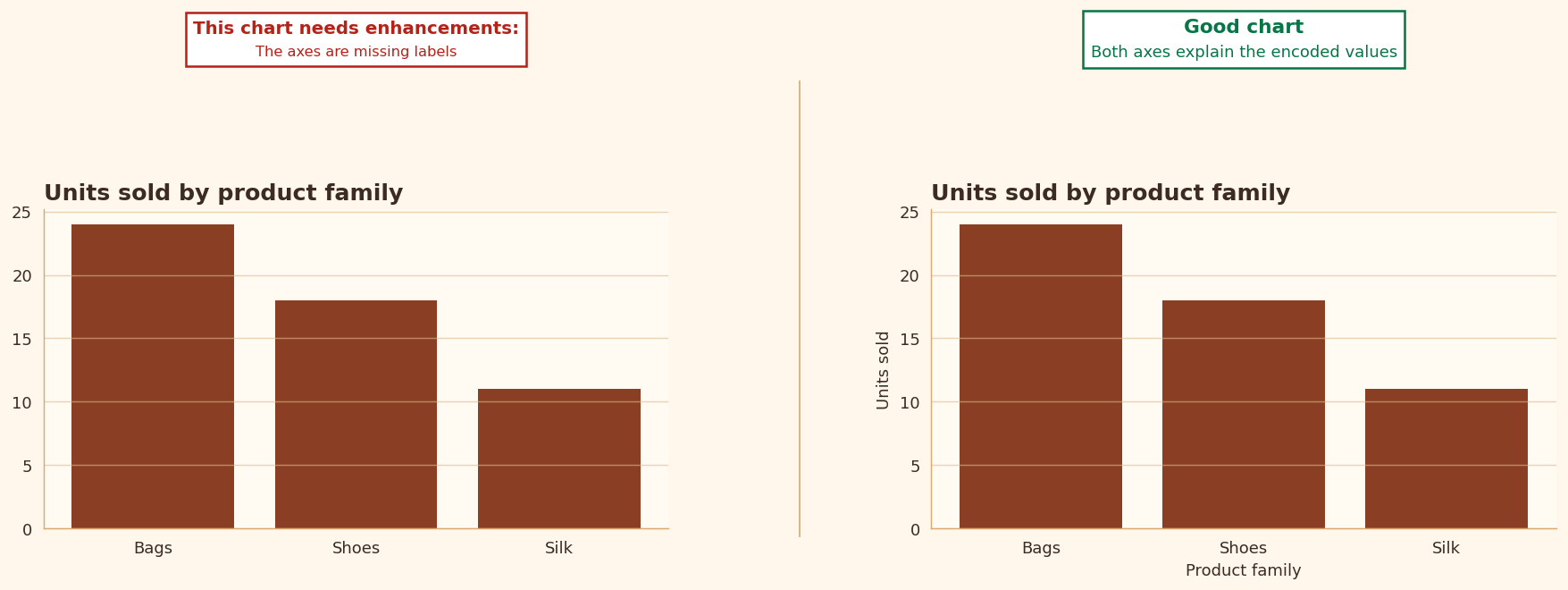
Axes are not decoration. They tell the reader what the values mean. Without them, even a visually clean chart can remain ambiguous.
- Missing labels force the reader to guess.
- Generic labels such as
Valueare only acceptable when the context is already unmistakable.
Rule 3: Units and scale clarity
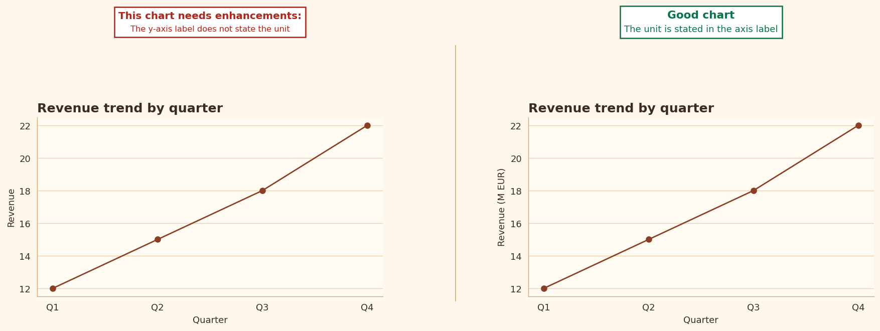
I insist on units because numbers by themselves are not enough. A value without a unit is incomplete information.
- I expect students to say whether a value is a percentage, a count, euros, kilograms, or something else.
- This matters even more when a figure circulates outside the notebook or slide deck in which it was created.
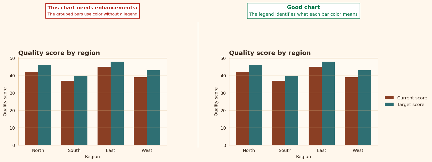
Rule 4: Legend clarity
Whenever a chart contains several series, the reader needs a clean bridge between the marks and their meaning. If that bridge is weak, reading slows down immediately.
- A missing legend delays interpretation.
- A vague legend weakens the chart even when the graphic itself is technically correct.
Rule 5: Annotation context
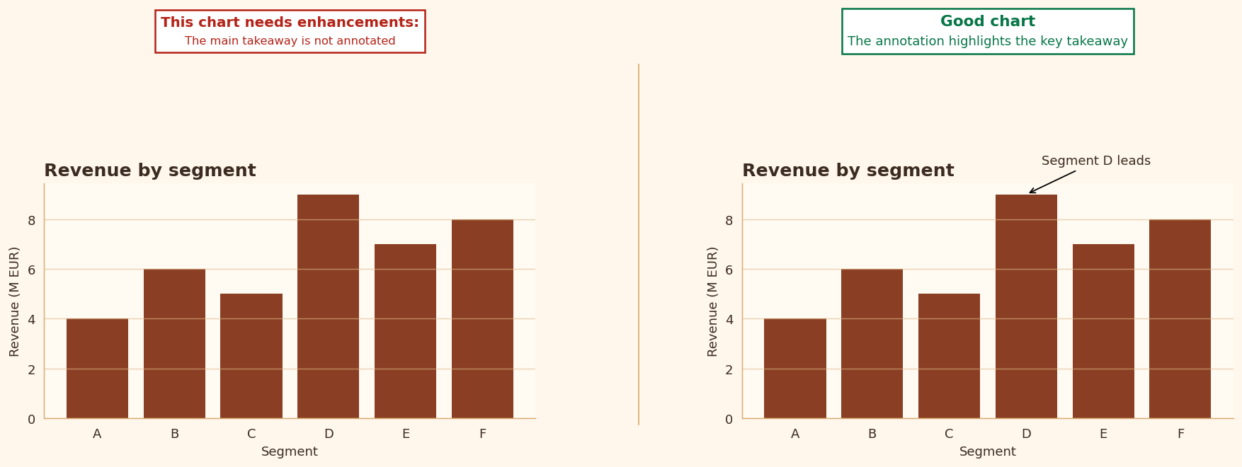
Some charts need more than labels and scales. They need a visible message. In class, I often tell students that if a chart contains one insight worth noticing, the chart should help the reader notice it.
- I encourage students to annotate an outlier, a turning point, or a key comparison.
- A short sentence inside the figure can sometimes do more than a paragraph outside it.
Rule 6: Uncertainty cues
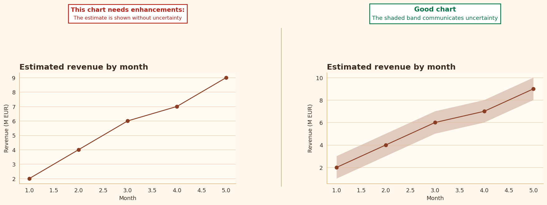
When values come from estimates, samples, or models, uncertainty is often part of the information. Leaving it out can make a result appear more definitive than it really is.
- Confidence intervals, error bars, or uncertainty bands can help reduce overconfidence.
- I treat this rule as a strong teaching prompt, even when it is not always an automatic failure condition.