Bad Data Visualization Examples
How I want you to use this chapter
In this chapter, we will explore together a series of visualizations that are often considered bad examples.
My goal is not simply to mock them.
I want to use them as teaching material.
For each case, we will ask the same core questions:
What makes the chart difficult to read?
What makes it incomplete or misleading?
Which of the 25 golden rules could have prevented the problem?
And if we had to redesign it, what would we change first?
Case 1. Emoji pie chart overload
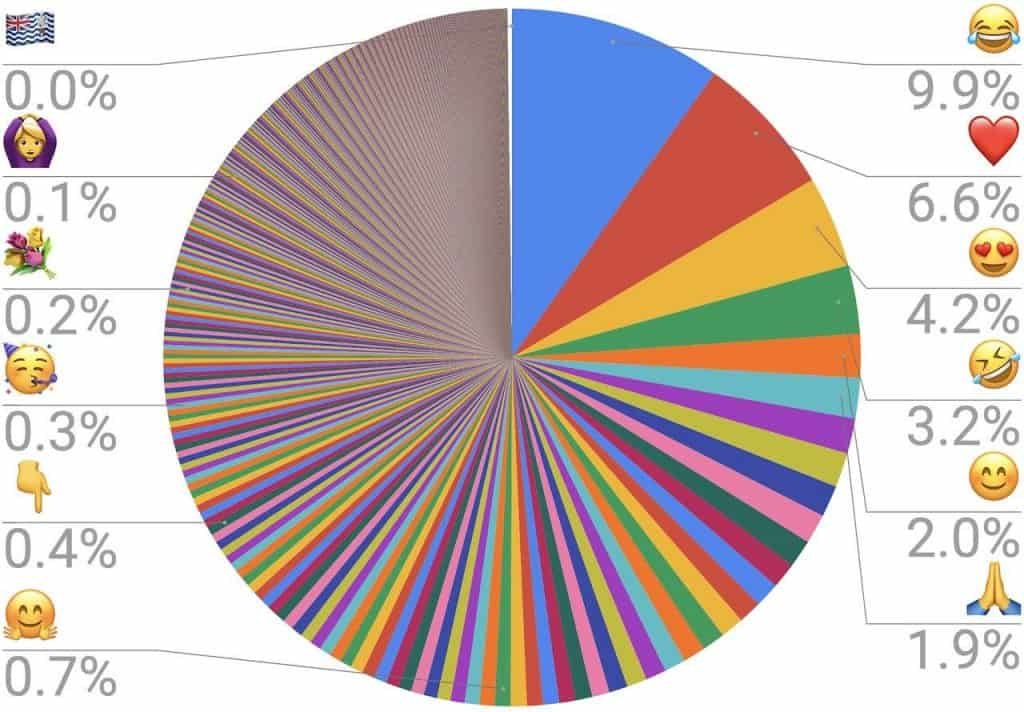
Why this chart fails
- The pie contains far too many categories.
- Many slices are too small to compare by angle or area.
- Labels are detached from the visual marks and force long eye movements.
- Color is used as category encoding far beyond what a reader can reliably track.
Which principles are violated
- Readability
- Integrity
Rules to keep in mind
- Too many categories
- Color accessibility
- Legend clarity
- Visual economy
How I would redesign it
- I would sort the categories and use a bar chart.
- I would group rare categories into
Other. - I would show only the top few items if the goal is ranking rather than exhaustive listing.
Further reading
Case 2. Overplotted lockdown spiral chart
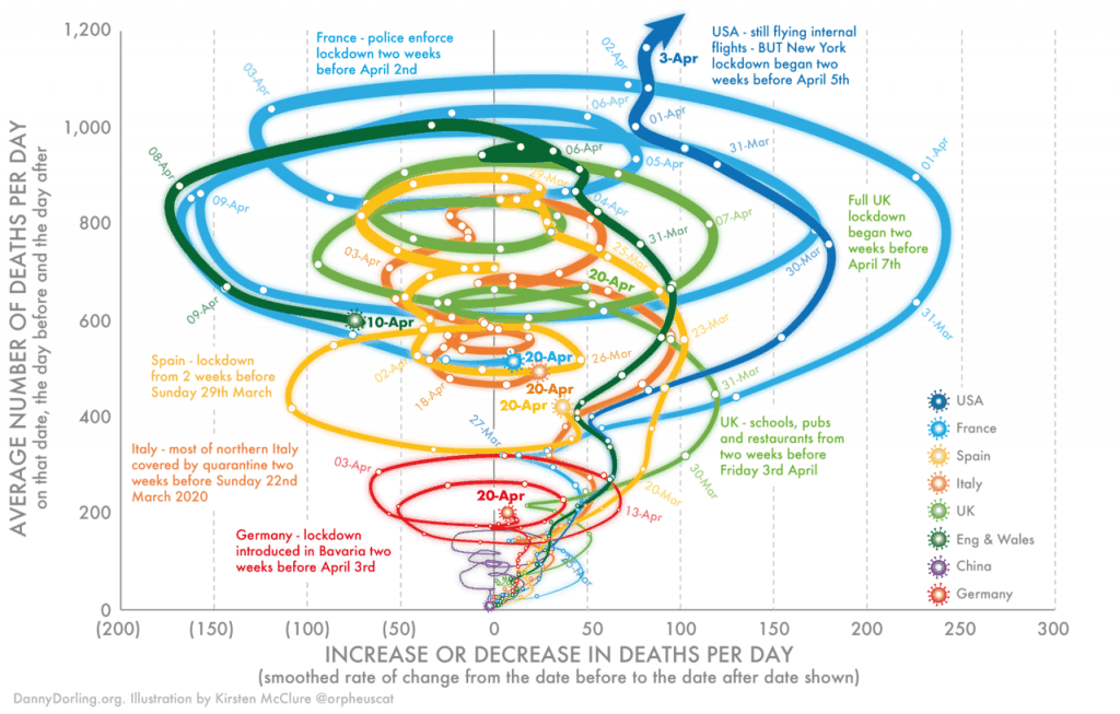
Why this chart fails
- Too many overlapping trajectories compete in the same space.
- Multiple annotations and curves create severe visual clutter.
- The geometry is hard to decode before the message can even be evaluated.
- Comparisons across countries are much harder than in a simpler layout.
Which principles are violated
- Readability
- Integrity
Rules to keep in mind
- Visual economy
- Readable labels and ticks
- Scatter overplotting
- Aspect ratio sanity
How I would redesign it
- I would use small multiples, one country per panel.
- I would use direct labels at endpoints only.
- I would remove decorative path styling and reduce annotation density.
further reading
Case 3. Donut charts for age composition
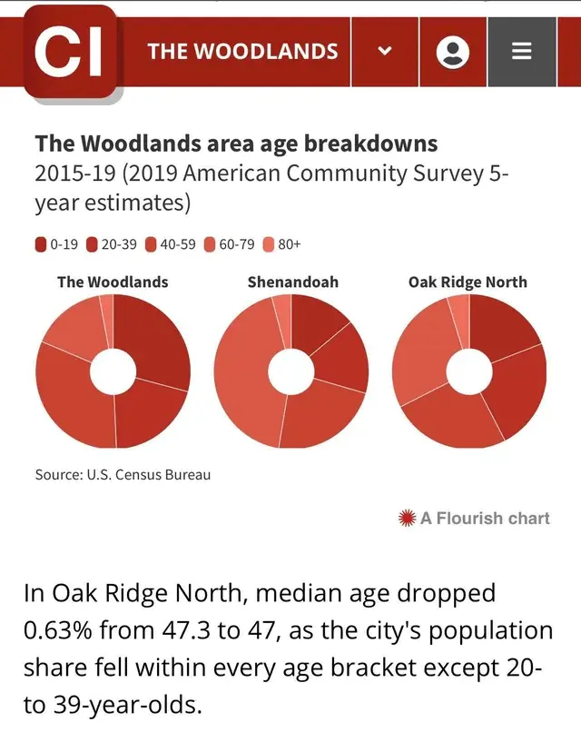
Why this chart fails
- Donut charts make small differences across groups difficult to compare.
- The design asks the reader to compare angles across multiple circles.
- The takeaway sentence below the chart is more precise than the chart itself can support visually.
Which principles are violated
- Readability
- Integrity
Rules to keep in mind
- Chart type
- Readability of labels
- Decimal precision
- Visual economy
How I would redesign it
- I would use grouped bars or stacked bars with a common baseline.
- If the point is age structure, I would compare directly by category rather than by angle.
Further reading
Case 4. 3D cancer bar chart (you have to avoid them!)
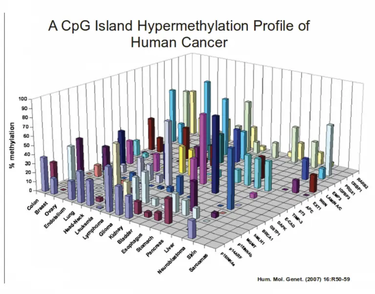
Why this chart fails
- The 3D perspective distorts height judgments.
- Occlusion hides bars behind bars.
- The grid and depth cues add complexity without improving interpretation.
- This is an extremely hard way to compare many categories.
Which principles are violated
- Readability
- Integrity
Rules to keep in mind
- Avoid chartjunk
- Chart type
- Visual economy
How I would redesign it
- I would use a heatmap, matrix, or small-multiple bar charts.
- I would keep the values on a flat 2D plane.
Further reading
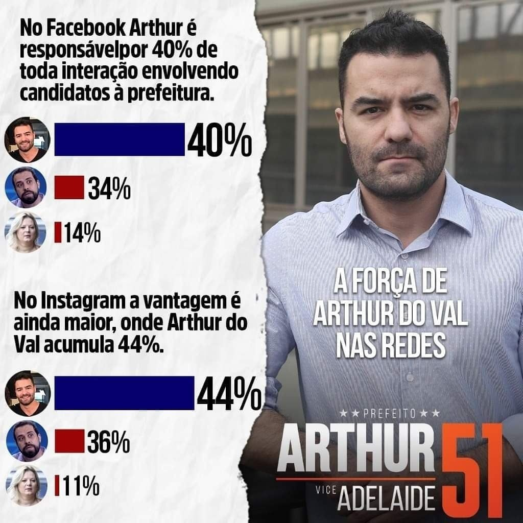
Case 5. Campaign bars with manipulative emphasis
Why this chart fails
- The bars are embedded inside campaign propaganda rather than neutral analytical framing.
- Candidate portraits and typography dominate the reading path.
- The message is promotional first and comparative second.
- The visual emphasis on one candidate is stronger than the underlying percentage gap warrants.
Which principles are violated
- Integrity
- Readability
Rules to keep in mind
- Appropriate scale
- Annotation context
- Category color consistency
- Visual economy
How I would redesign it
- I would remove campaign portrait dominance.
- I would use a neutral title and direct comparative bars on the same scale.
- I would separate persuasion from analysis.
Further reading
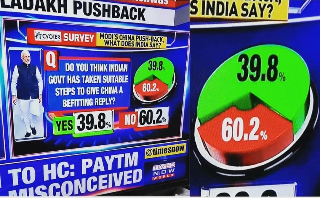
Case 6. 3D pie chart on television
Why this chart fails
- The 3D pie exaggerates the slice in front and compresses the slice behind.
- The chart uses an especially poor form for a simple binary split.
- Heavy TV-style decoration distracts from the actual numbers.
Which principles are violated
- Integrity
- Readability
Rules to keep in mind
- Appropriate scale
- Avoid chartjunk
- Chart type
- Visual economy
How I would redesign it
- I would use a simple 2D bar chart or even just the two numbers.
- If the goal is a yes/no split, I would use one horizontal bar.
Further reading
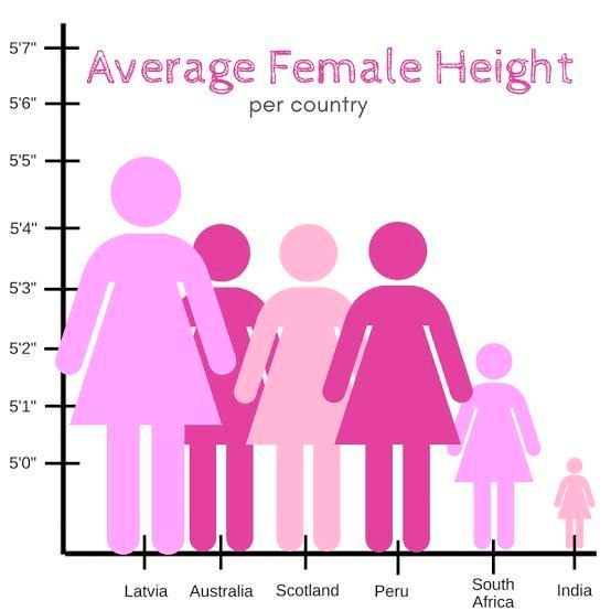
Case 7. Human pictogrammes
Why this chart fails
- The icons scale in both height and width, so area exaggerates the differences.
- The visual impression is much larger than the actual height differences.
- The graphic uses pictograms where a bar chart would be clearer and more honest.
Which principles are violated
- Integrity
- Readability
Rules to keep in mind
- Chart type
- Aspect ratio sanity
- Visual economy
How I would redesign it
- I would use a common-baseline bar chart.
- If I kept icons, I would keep the width constant and encode only height.
Further reading
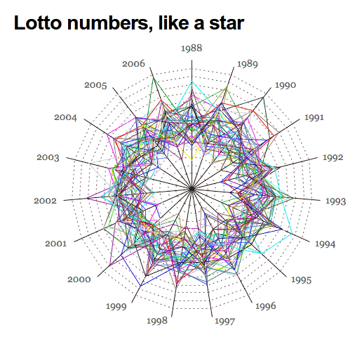
Case 8. Radar chart spaghetti
Why this chart fails
- Too many overlapping lines make the structure unreadable.
- The circular arrangement creates artificial neighbor relationships.
- The chart makes it hard to answer even a basic comparison question.
Which principles are violated
- Readability
- Integrity
Rules to keep in mind
- Visual economy
- Readable labels and ticks
- Chart type
How I would redesign it
- I would use a line chart, table, or small multiples.
- If I were comparing lottery numbers over time, I would keep time on a linear axis.
Further reading
Case 9. Rainbow choropleth and decorative gradients
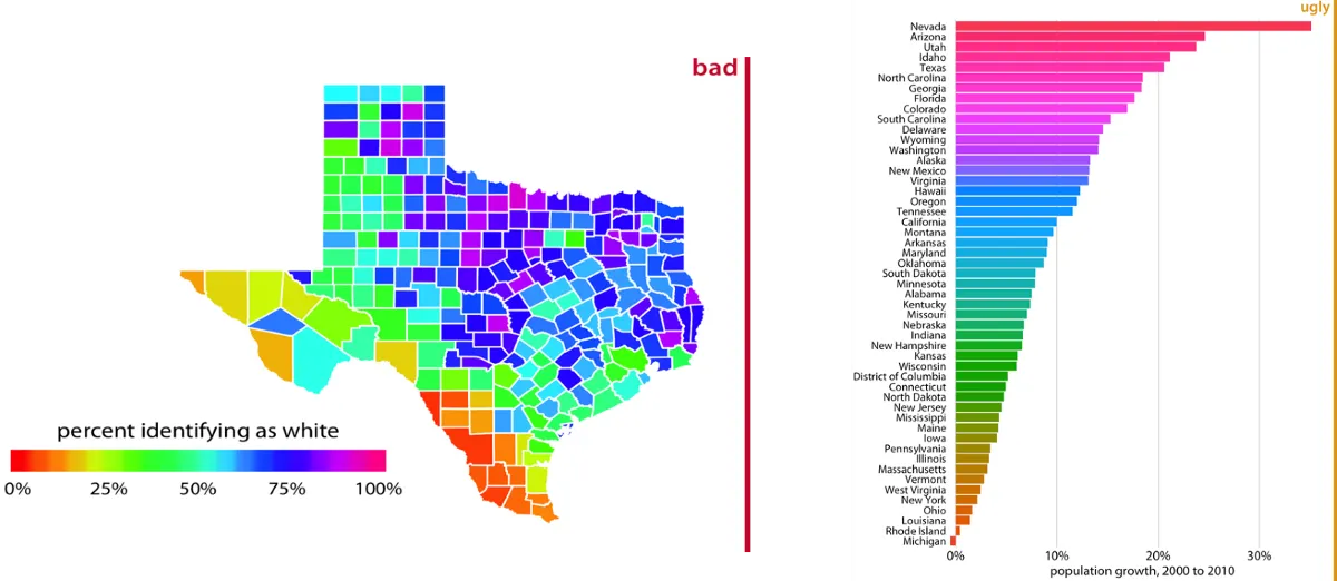
Why this chart fails
- The map uses a rainbow-like scale that creates false boundaries.
- The color order is not perceptually intuitive for the underlying quantity.
- The companion bar chart also uses a decorative gradient that encodes more style than meaning.
Which principles are violated
- Integrity
- Readability
Rules to keep in mind
- Color map quality
- Color accessibility
- Visual economy
How I would redesign it
- I would use a single-hue sequential palette for ordered data.
- I would keep color semantics stable and low-noise.
Further reading
Is that all?
Absolutly not !
The examples of bad and misleading data viz is almost infinite!
I would invite you to some further reading and visual analysis of more examples online.