Integrity
Why I treat integrity as non-negotiable
A chart can look polished, modern, and convincing while still distorting the data. That is why integrity matters so much. Here, the issue is no longer just clarity or completeness. The issue is whether the visual form leads the reader toward a false conclusion.
In this chapter, we look at the rules that protect a chart from exaggeration, distortion, and misleading comparison.
The rules I group under integrity
- Rule 17. Appropriate scale
- Rule 18. Chart type
- Rule 19. Color map quality
- Rule 20. Avoid dual axes
- Rule 21. Area baseline
- Rule 22. Aspect ratio sanity
- Rule 23. Histogram bin quality
- Rule 24. Category color consistency
- Rule 25. Diverging zero reference
Rule 17: Appropriate scale
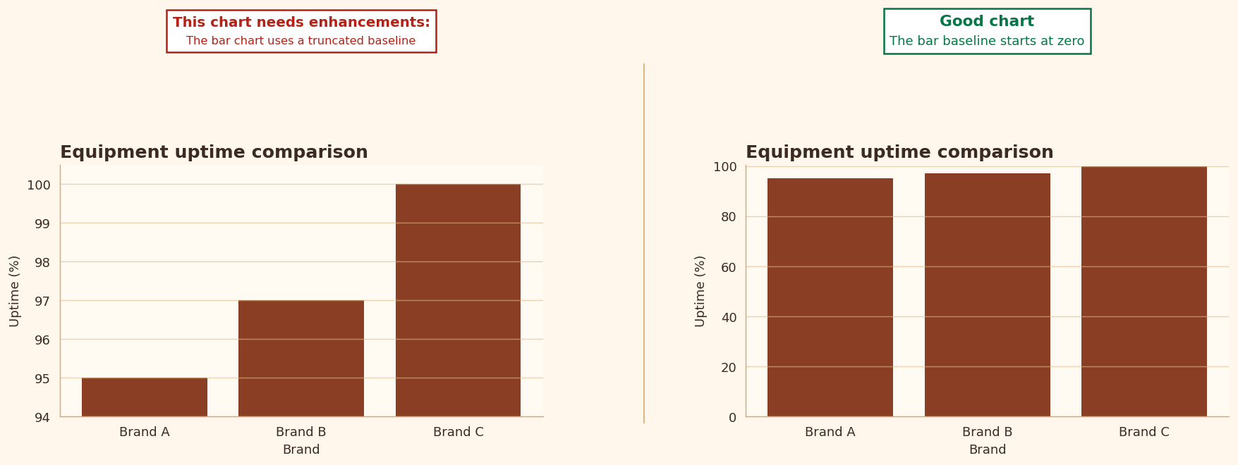
With bar charts, length is the key encoding. When the baseline is truncated, the visual difference becomes exaggerated.
- This is one of the clearest and most teachable examples of visual misrepresentation.
- In most cases, if the chart uses bars, I expect the baseline to start at zero.
Rule 18: Chart type
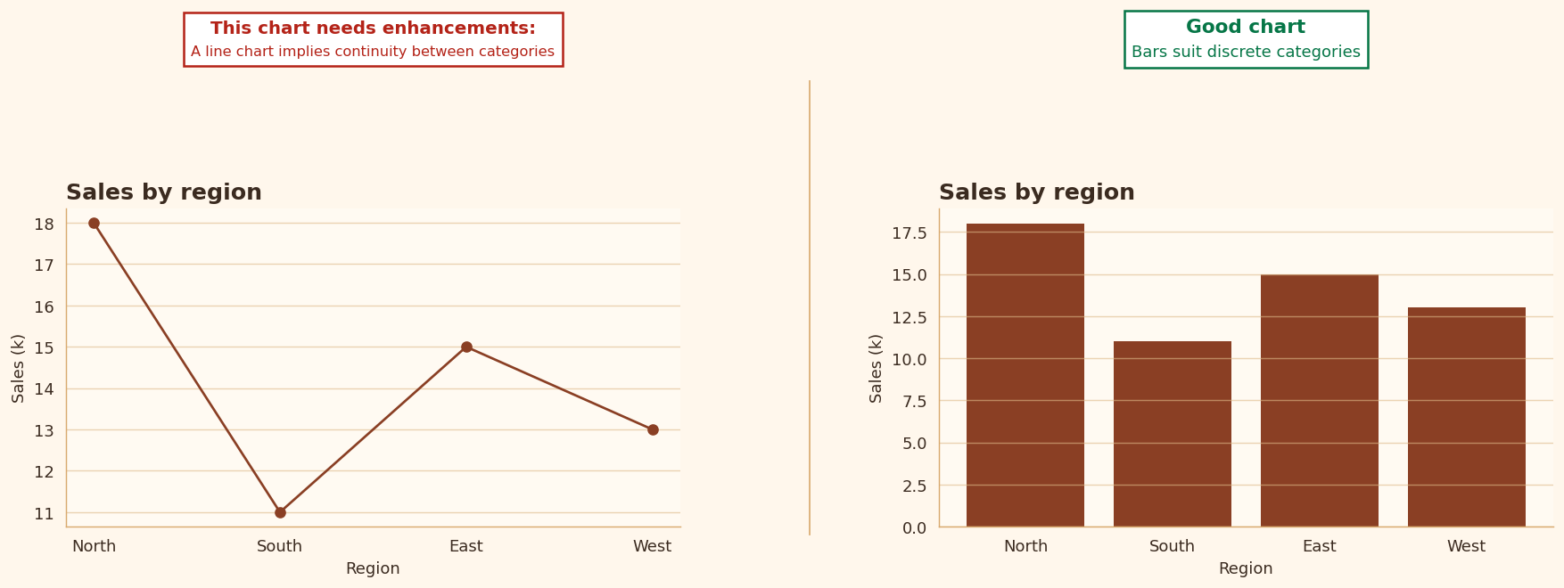
I often tell students that a chart type is not a stylistic choice first. It is a structural choice. The encoding must match the kind of data and the kind of question being asked.
- Time series generally call for lines.
- Categories usually call for bars.
- Relationships call for scatter plots.
- Distributions call for histograms.
Rule 19: Color map quality
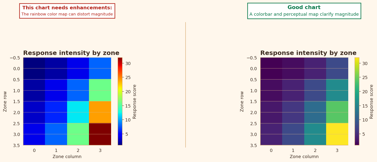
Continuous color scales can easily mislead when they create false boundaries or uneven emphasis. This is one reason I am cautious with rainbow-like palettes.
- A bad palette can suggest structure that is not really there.
- Sequential or diverging schemes are usually safer and more interpretable.
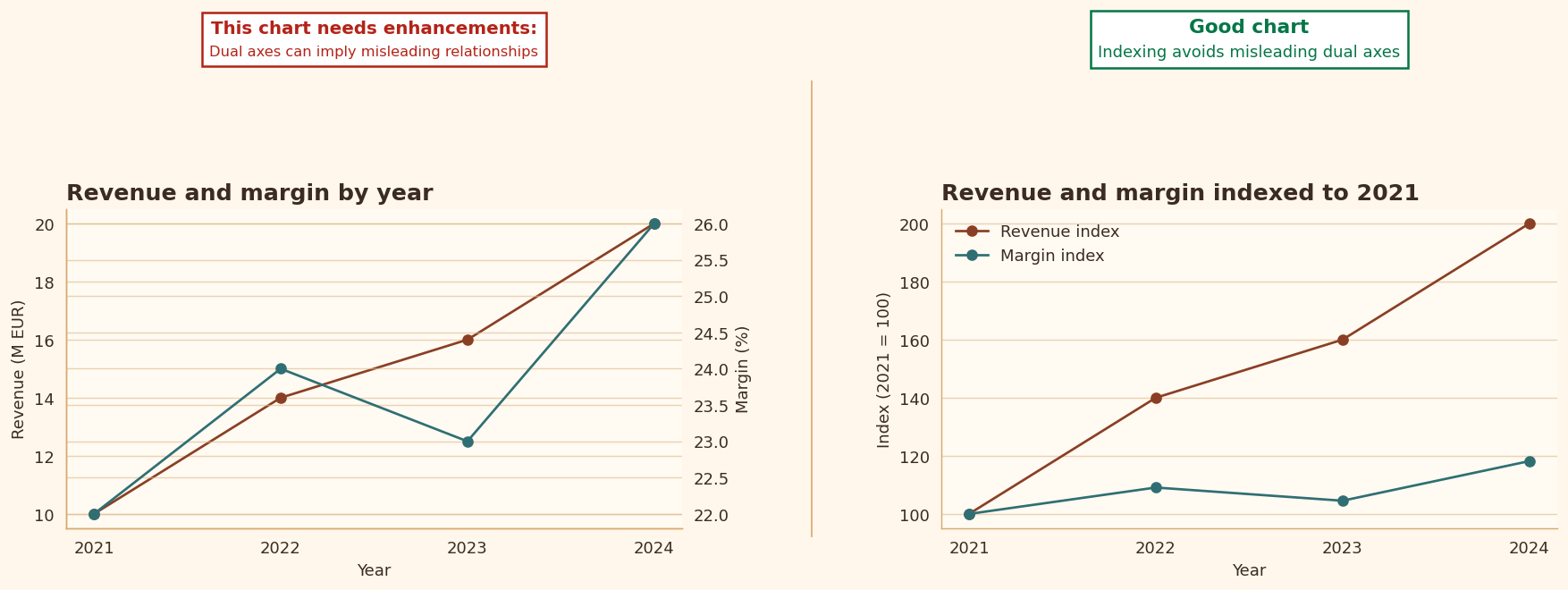
Rule 20: Avoid dual axes
Dual-axis charts often tempt the reader into comparing two shapes that should not be compared directly. Sharing space creates a visual invitation to draw conclusions across unrelated scales.
- In class, I use these charts to discuss misleading alignment.
- Even when they are technically possible, they are very often pedagogically unhelpful.
Rule 21: Area baseline
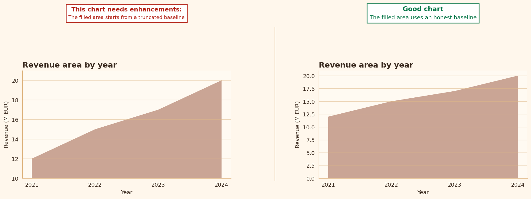
Area charts do not just show position. They also use filled space as evidence. That means the baseline matters a great deal.
- A truncated baseline inflates perceived magnitude.
- I want students to treat filled areas with the same caution they would apply to bars.
Rule 22: Aspect ratio sanity
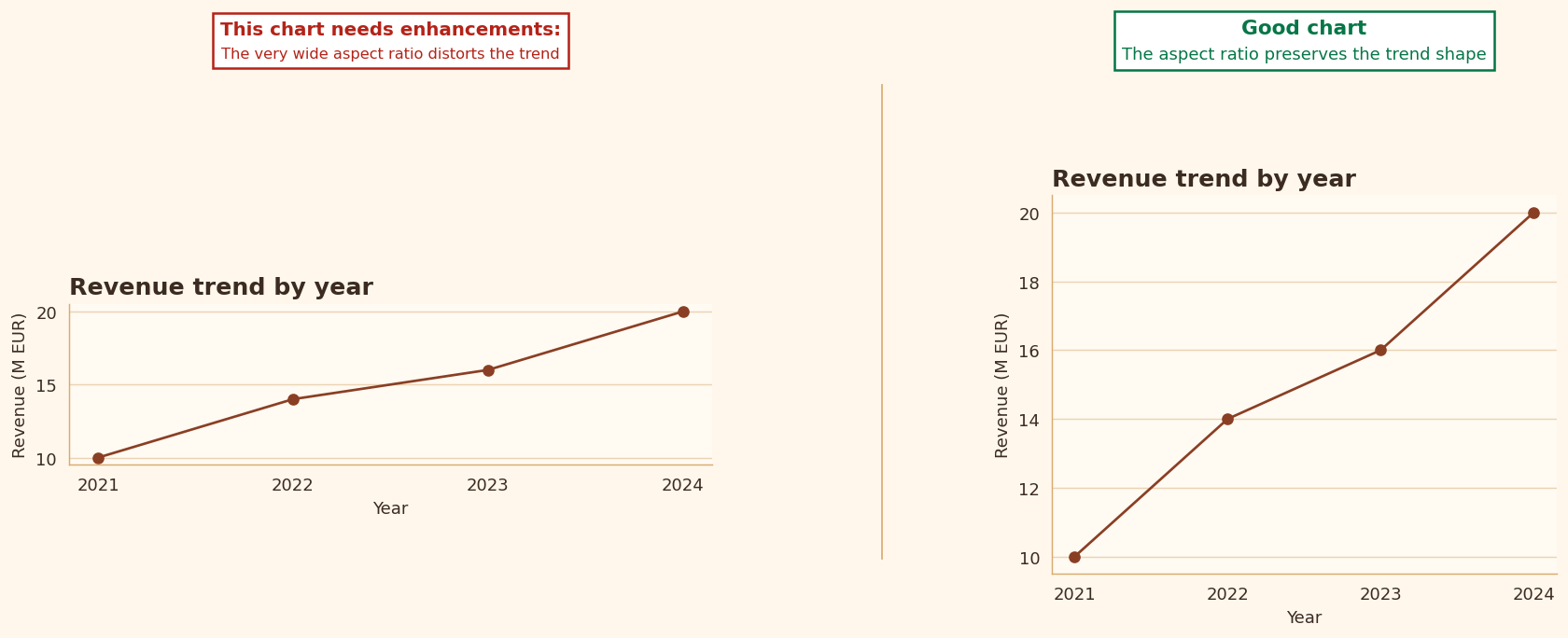
The shape of a figure changes how a pattern feels. A very wide chart can flatten variation. A very tall chart can make slopes feel dramatic.
- This is not a minor cosmetic issue.
- The aspect ratio can materially influence interpretation.
Rule 23: Histogram bin quality
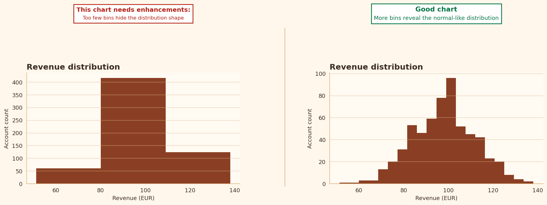
Histograms are sensitive to binning. A poor bin choice can hide real structure or create noisy pseudo-structure.
- Too few bins hide the distribution’s shape.
- Too many bins can make randomness look meaningful.
Rule 24: Category color consistency
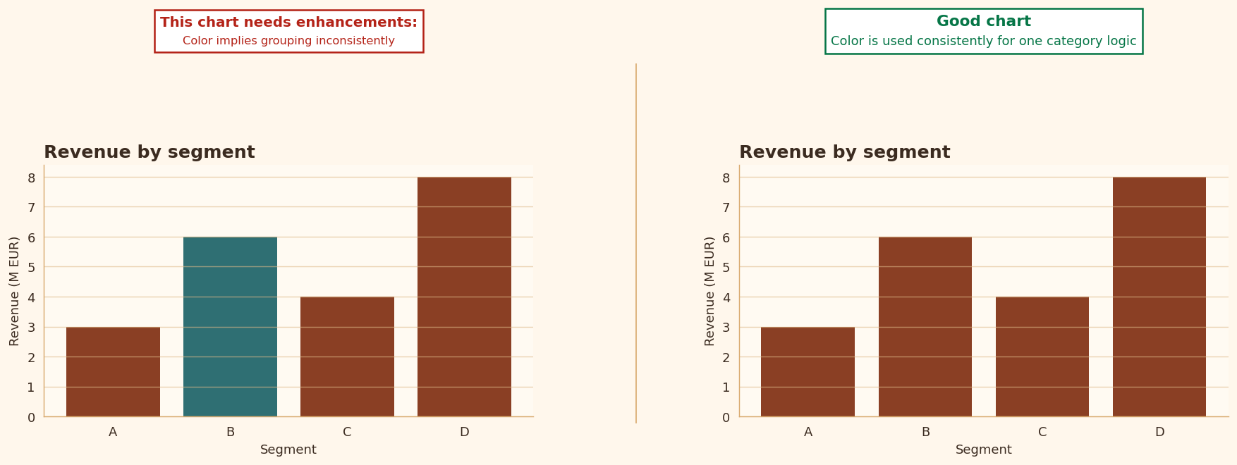
Color should carry a stable meaning. If categories change color arbitrarily from one part of a chart to another, the reader may infer groups or contrasts that do not exist.
- If one category is highlighted, that choice should be intentional and explained.
- I do not want color logic to drift without reason.
Rule 25: Diverging zero reference
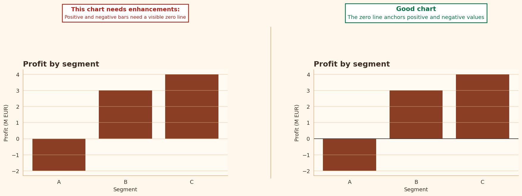
Whenever values cross zero, the zero line becomes a crucial visual anchor. Without it, gains and losses become harder to compare and the direction of change becomes less legible.
- This matters especially in finance, residuals, and deviation charts.
- If a chart is about positive versus negative movement, I want zero to be visually explicit.