Exemples de code Python
Chaque exemple est un extrait Matplotlib complet et autonome. Dans les bonnes versions, les lignes ajoutées ou corrigées sont mises en évidence.
Règles de complétude
Les règles 1 à 6 vérifient si le graphique contient assez d’information pour être compris à lui seul.
Règle 1 : Titre clair
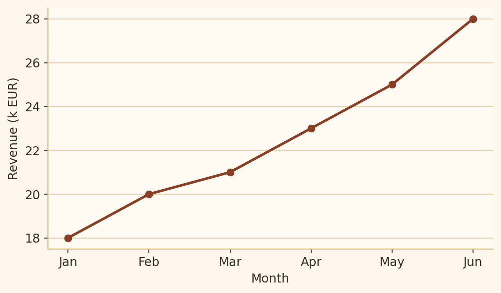
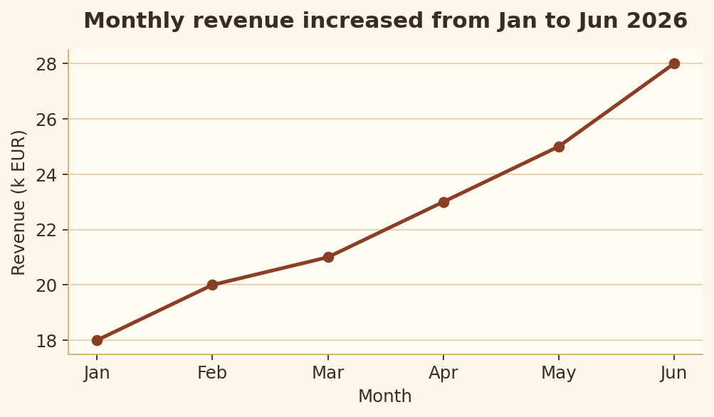
Le titre doit dire au lecteur de quoi parle le graphique avant même qu’il examine les marques visuelles.
import matplotlib.pyplot as plt

months = ["Jan", "Feb", "Mar", "Apr", "May", "Jun"]
revenue = [18, 20, 21, 23, 25, 28]

fig, ax = plt.subplots(figsize=(6.4, 3.8))
ax.plot(months, revenue, marker="o")
ax.set_xlabel("Month")
ax.set_ylabel("Revenue (k EUR)")
plt.show()
import matplotlib.pyplot as plt

months = ["Jan", "Feb", "Mar", "Apr", "May", "Jun"]
revenue = [18, 20, 21, 23, 25, 28]

fig, ax = plt.subplots(figsize=(6.4, 3.8))
ax.plot(months, revenue, marker="o")
ax.set_title("Monthly revenue increased from Jan to Jun 2026")
ax.set_xlabel("Month")
ax.set_ylabel("Revenue (k EUR)")
plt.show()
Règle 2 : Étiquettes d’axes
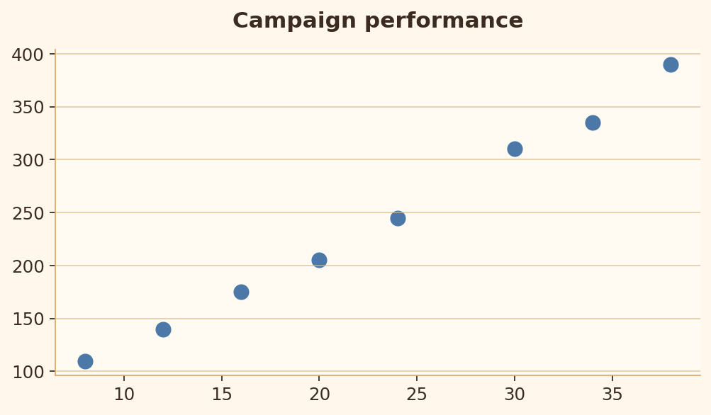
Les étiquettes d’axes et les unités lèvent toute ambiguïté sur ce qui est mesuré.
import matplotlib.pyplot as plt

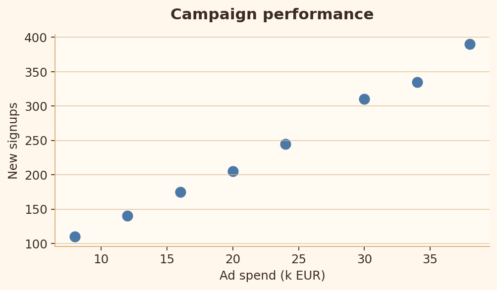
ad_spend = [8, 12, 16, 20, 24, 30, 34, 38]
signups = [110, 140, 175, 205, 245, 310, 335, 390]

fig, ax = plt.subplots(figsize=(6.4, 3.8))
ax.scatter(ad_spend, signups)
ax.set_title("Campaign performance")
plt.show()
import matplotlib.pyplot as plt

ad_spend = [8, 12, 16, 20, 24, 30, 34, 38]
signups = [110, 140, 175, 205, 245, 310, 335, 390]

fig, ax = plt.subplots(figsize=(6.4, 3.8))
ax.scatter(ad_spend, signups)
ax.set_title("Campaign performance")
ax.set_xlabel("Ad spend (k EUR)")
ax.set_ylabel("New signups")
plt.show()
Règle 3 : Clarté des unités et de l’échelle
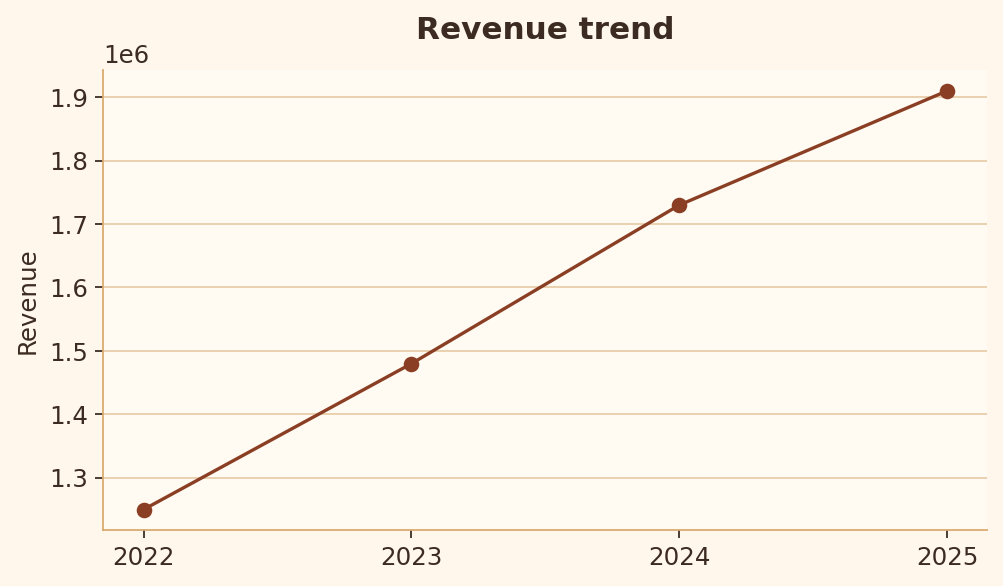
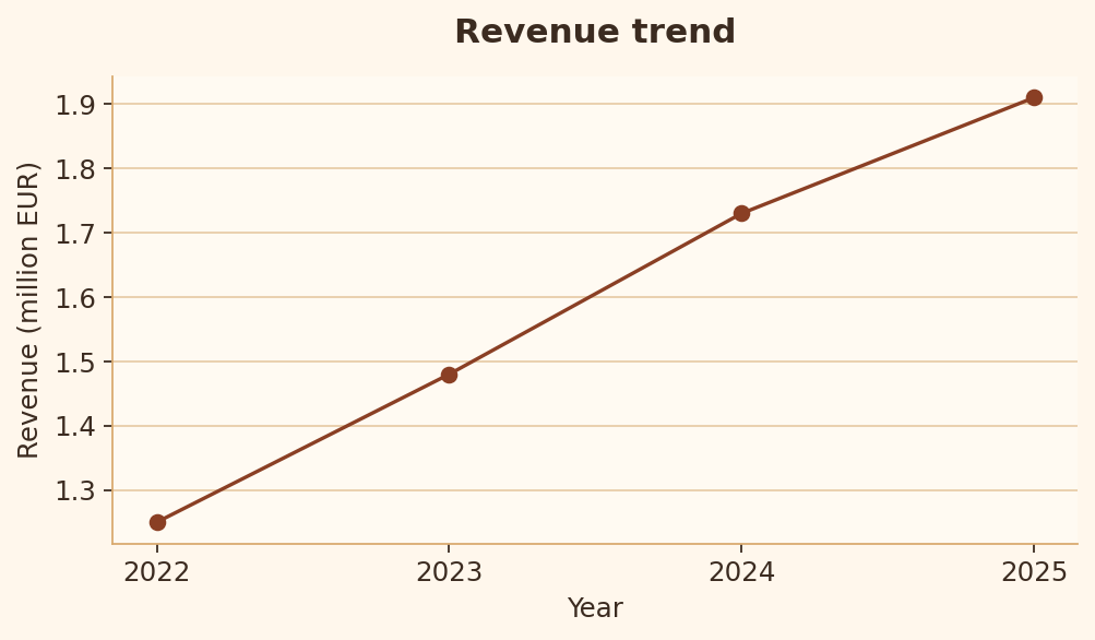
Les grandes valeurs doivent être mises à l’échelle et étiquetées pour que le lecteur sache immédiatement ce que signifient les nombres.
import matplotlib.pyplot as plt

years = [2022, 2023, 2024, 2025]
revenue = [1250000, 1480000, 1730000, 1910000]

fig, ax = plt.subplots(figsize=(6.4, 3.8))
ax.plot(years, revenue, marker="o")
ax.set_title("Revenue trend")
ax.set_ylabel("Revenue")
plt.show()
import matplotlib.pyplot as plt

years = [2022, 2023, 2024, 2025]
revenue = [1250000, 1480000, 1730000, 1910000]
revenue_millions = [value / 1_000_000 for value in revenue]

fig, ax = plt.subplots(figsize=(6.4, 3.8))
ax.plot(years, revenue_millions, marker="o")
ax.set_title("Revenue trend")
ax.set_xlabel("Year")
ax.set_ylabel("Revenue (million EUR)")
plt.show()
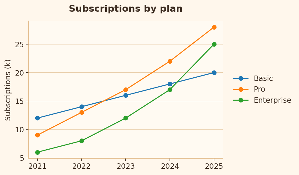
Règle 4 : Clarté de la légende
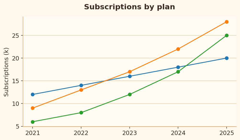
Dès qu’il y a plusieurs séries, il faut des libellés clairs pour que le lecteur identifie chaque ligne.
import matplotlib.pyplot as plt

years = [2021, 2022, 2023, 2024, 2025]
series = {
    "Basic": [12, 14, 16, 18, 20],
    "Pro": [9, 13, 17, 22, 28],
    "Enterprise": [6, 8, 12, 17, 25],
}

fig, ax = plt.subplots(figsize=(6.4, 3.8))
for values in series.values():
    ax.plot(years, values, marker="o")
ax.set_title("Subscriptions by plan")
ax.set_ylabel("Subscriptions (k)")
plt.show()
import matplotlib.pyplot as plt

years = [2021, 2022, 2023, 2024, 2025]
series = {
    "Basic": [12, 14, 16, 18, 20],
    "Pro": [9, 13, 17, 22, 28],
    "Enterprise": [6, 8, 12, 17, 25],
}

fig, ax = plt.subplots(figsize=(6.4, 3.8))
for label, values in series.items():
    ax.plot(years, values, marker="o", label=label)
ax.legend(loc="center left", bbox_to_anchor=(1.02, 0.5))
ax.set_title("Subscriptions by plan")
ax.set_ylabel("Subscriptions (k)")
plt.show()
Règle 5 : Contexte d’annotation
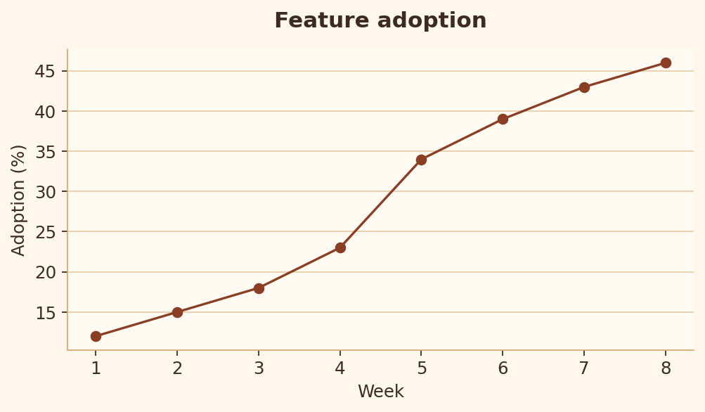
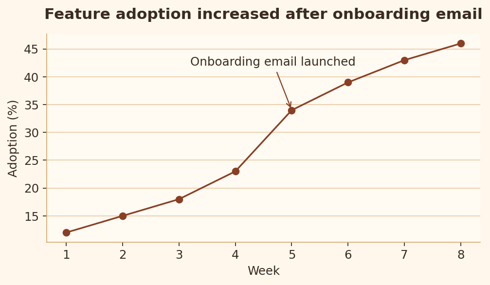
Quand un événement ou une idée clé explique le motif, il doit être visible dans le graphique.
import matplotlib.pyplot as plt

weeks = [1, 2, 3, 4, 5, 6, 7, 8]
adoption = [12, 15, 18, 23, 34, 39, 43, 46]

fig, ax = plt.subplots(figsize=(6.4, 3.8))
ax.plot(weeks, adoption, marker="o")
ax.set_title("Feature adoption")
ax.set_xlabel("Week")
ax.set_ylabel("Adoption (%)")
plt.show()
import matplotlib.pyplot as plt

weeks = [1, 2, 3, 4, 5, 6, 7, 8]
adoption = [12, 15, 18, 23, 34, 39, 43, 46]

fig, ax = plt.subplots(figsize=(6.4, 3.8))
ax.plot(weeks, adoption, marker="o")
ax.annotate("Onboarding email launched", xy=(5, 34), xytext=(3.2, 42), arrowprops={"arrowstyle": "->"})
ax.set_title("Feature adoption increased after onboarding email")
ax.set_xlabel("Week")
ax.set_ylabel("Adoption (%)")
plt.show()
Règle 6 : Indices d’incertitude
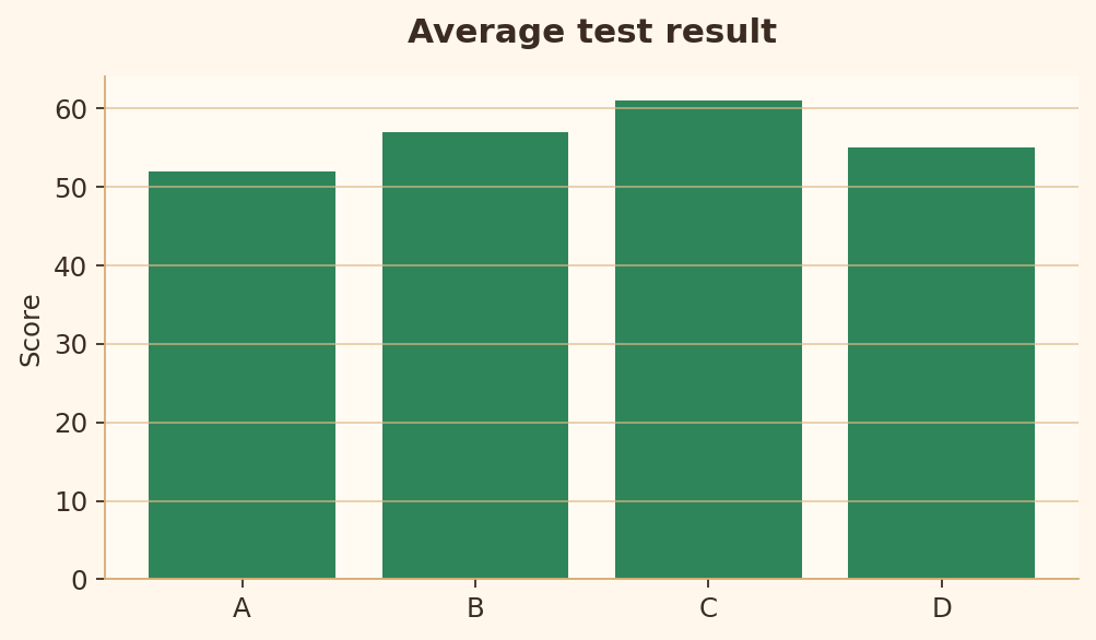
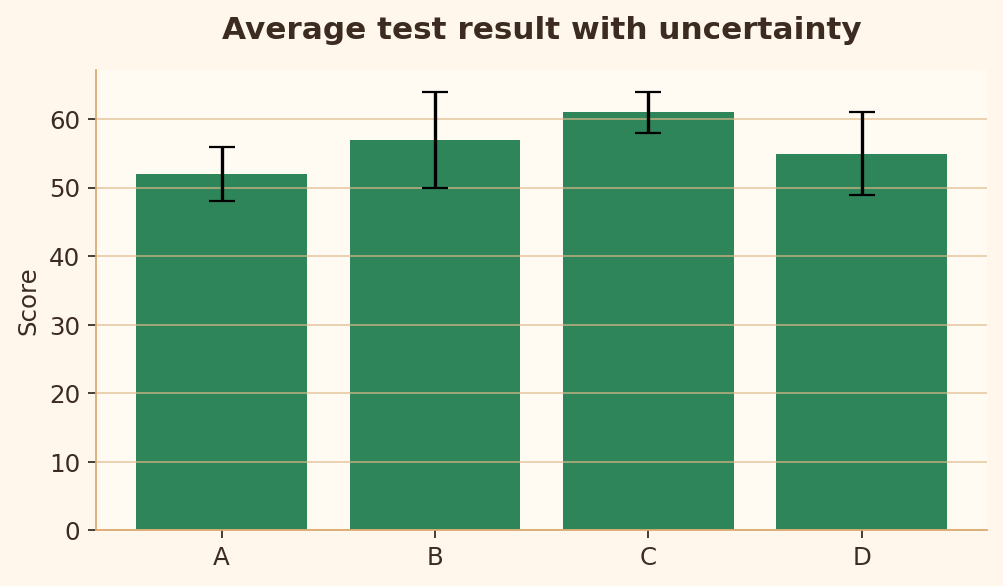
Les estimations doivent montrer l’incertitude lorsque celle-ci compte pour l’interprétation.
import matplotlib.pyplot as plt

groups = ["A", "B", "C", "D"]
mean = [52, 57, 61, 55]
error = [4, 7, 3, 6]

fig, ax = plt.subplots(figsize=(6.4, 3.8))
ax.bar(groups, mean)
ax.set_title("Average test result")
ax.set_ylabel("Score")
plt.show()
import matplotlib.pyplot as plt

groups = ["A", "B", "C", "D"]
mean = [52, 57, 61, 55]
error = [4, 7, 3, 6]

fig, ax = plt.subplots(figsize=(6.4, 3.8))
ax.bar(groups, mean, yerr=error, capsize=6)
ax.set_title("Average test result with uncertainty")
ax.set_ylabel("Score")
plt.show()
Règles de lisibilité
Les règles 7 à 16 vérifient si le graphique peut être lu, parcouru et comparé sans effort inutile.
Règle 7 : Étiquettes lisibles
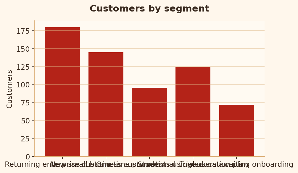
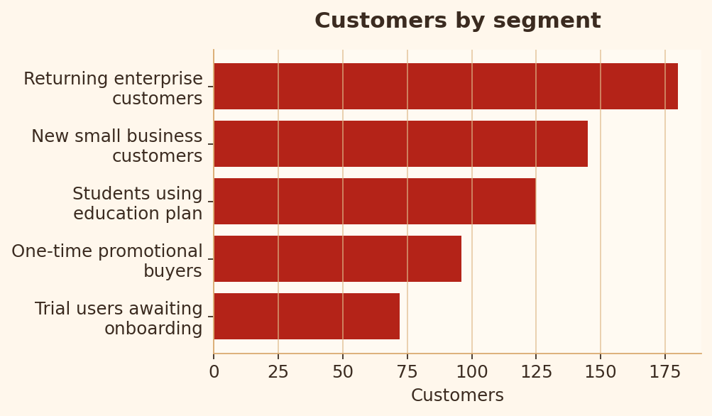
Des libellés longs ne doivent ni se chevaucher ni obliger le lecteur à déchiffrer un axe saturé.
import matplotlib.pyplot as plt

segments = [
    "Returning enterprise customers",
    "New small business customers",
    "One-time promotional buyers",
    "Students using education plan",
    "Trial users awaiting onboarding",
]
counts = [180, 145, 96, 125, 72]

fig, ax = plt.subplots(figsize=(6.4, 3.8))
ax.bar(segments, counts)
ax.set_title("Customers by segment")
plt.show()
import matplotlib.pyplot as plt
import textwrap

segments = [
    "Returning enterprise customers",
    "New small business customers",
    "One-time promotional buyers",
    "Students using education plan",
    "Trial users awaiting onboarding",
]
counts = [180, 145, 96, 125, 72]
labels = [textwrap.fill(s, 22) for s in segments]
pairs = sorted(zip(counts, labels))

fig, ax = plt.subplots(figsize=(6.4, 3.8))
ax.barh([label for _, label in pairs], [count for count, _ in pairs])
ax.set_title("Customers by segment")
ax.set_xlabel("Customers")
plt.show()
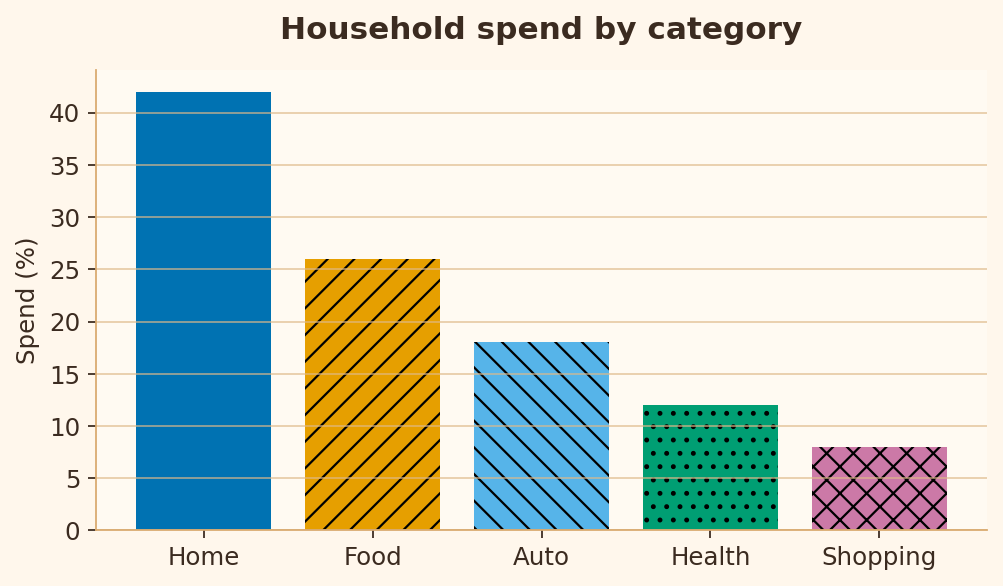
Règle 8 : Accessibilité des couleurs
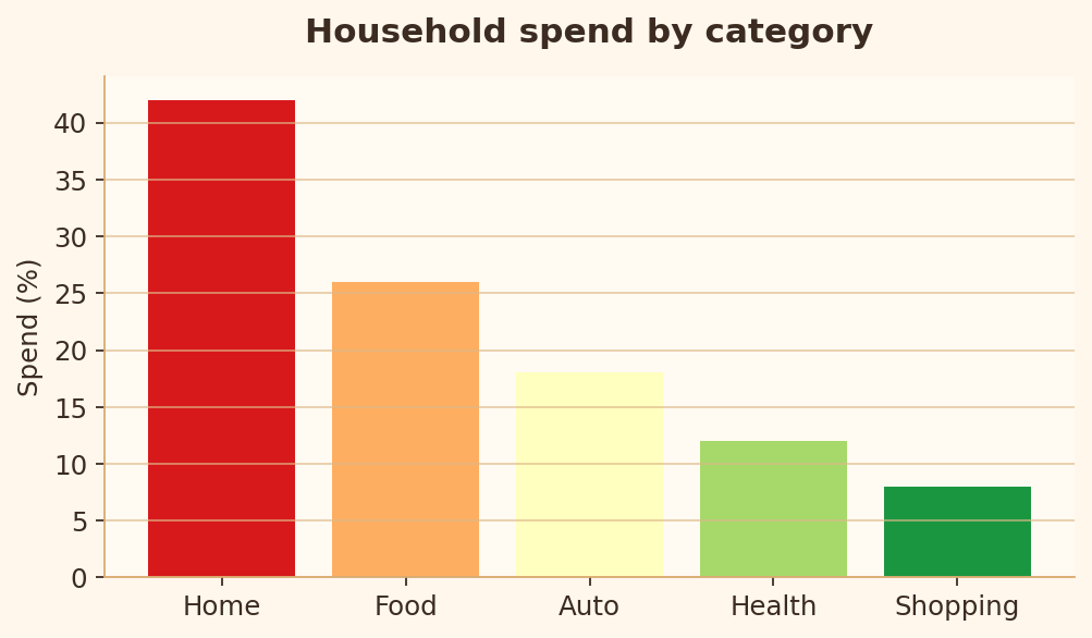
Les graphiques doivent rester lisibles pour les personnes ayant des déficiences de vision des couleurs.
import matplotlib.pyplot as plt

segments = ["Home", "Food", "Auto", "Health", "Shopping"]
spend = [42, 26, 18, 12, 8]
colors = ["#d7191c", "#fdae61", "#ffffbf", "#a6d96a", "#1a9641"]

fig, ax = plt.subplots(figsize=(6.4, 3.8))
ax.bar(segments, spend, color=colors)
ax.set_title("Household spend by category")
ax.set_ylabel("Spend (%)")
plt.show()
import matplotlib.pyplot as plt

segments = ["Home", "Food", "Auto", "Health", "Shopping"]
spend = [42, 26, 18, 12, 8]
colors = ["#0072B2", "#E69F00", "#56B4E9", "#009E73", "#CC79A7"]
hatches = ["", "//", "\\", "..", "xx"]

fig, ax = plt.subplots(figsize=(6.4, 3.8))
bars = ax.bar(segments, spend, color=colors)
for bar, hatch in zip(bars, hatches):
    bar.set_hatch(hatch)
ax.set_title("Household spend by category")
ax.set_ylabel("Spend (%)")
plt.show()
Règle 9 : Étiquetage direct
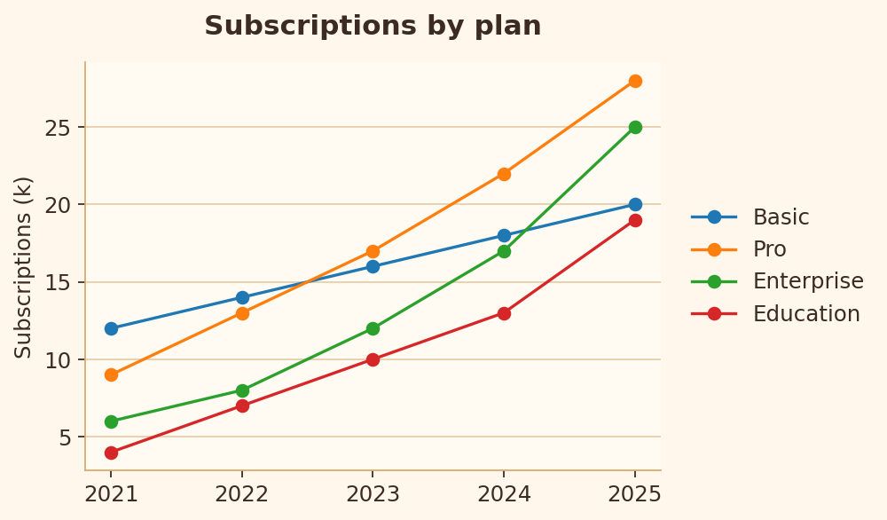
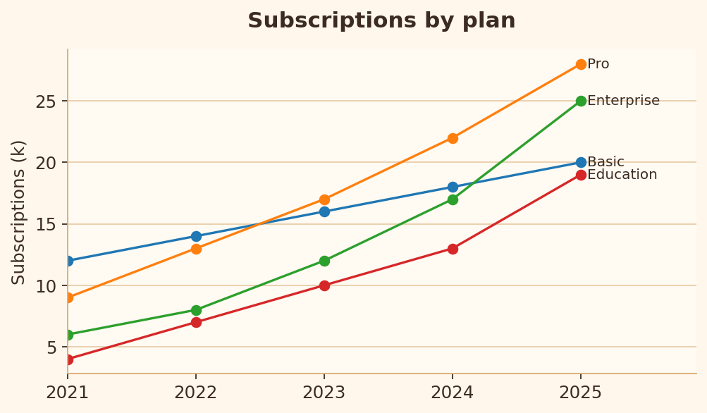
Quand les lignes peuvent être étiquetées directement, le lecteur ne devrait pas avoir à faire des allers-retours entre le tracé et la légende.
import matplotlib.pyplot as plt

years = [2021, 2022, 2023, 2024, 2025]
series = {
    "Basic": [12, 14, 16, 18, 20],
    "Pro": [9, 13, 17, 22, 28],
    "Enterprise": [6, 8, 12, 17, 25],
    "Education": [4, 7, 10, 13, 19],
}

fig, ax = plt.subplots(figsize=(6.4, 3.8))
for label, values in series.items():
    ax.plot(years, values, marker="o", label=label)
ax.legend()
ax.set_title("Subscriptions by plan")
ax.set_ylabel("Subscriptions (k)")
plt.show()
import matplotlib.pyplot as plt

years = [2021, 2022, 2023, 2024, 2025]
series = {
    "Basic": [12, 14, 16, 18, 20],
    "Pro": [9, 13, 17, 22, 28],
    "Enterprise": [6, 8, 12, 17, 25],
    "Education": [4, 7, 10, 13, 19],
}

fig, ax = plt.subplots(figsize=(6.4, 3.8))
for label, values in series.items():
    ax.plot(years, values, marker="o")
    ax.text(years[-1] + 0.05, values[-1], label, va="center")
ax.set_xlim(2021, 2025.9)
ax.set_title("Subscriptions by plan")
ax.set_ylabel("Subscriptions (k)")
plt.show()
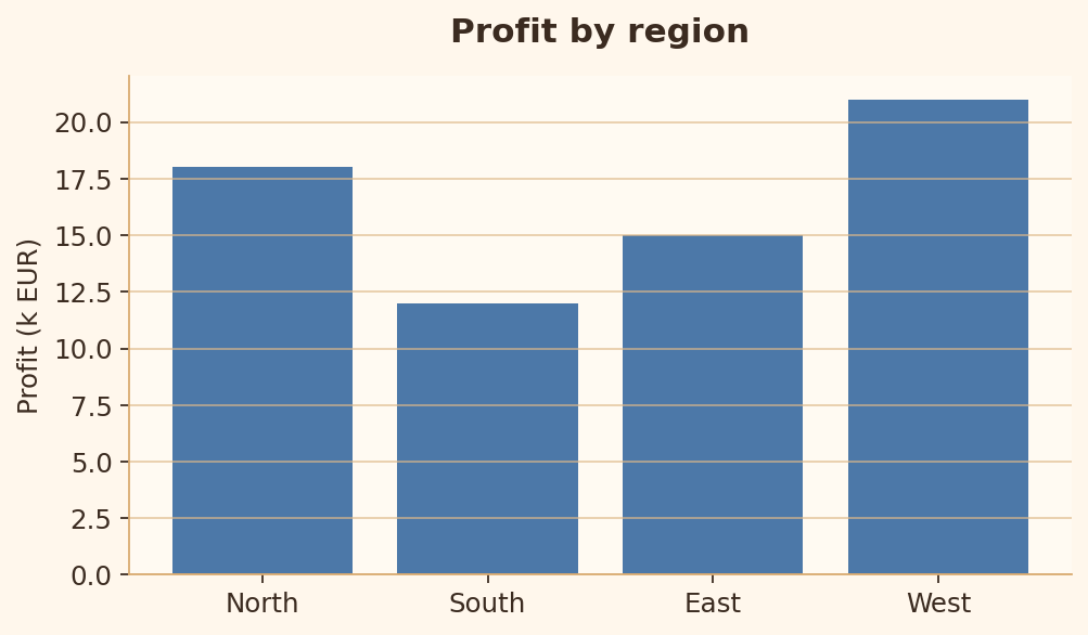
Règle 10 : Éviter le chartjunk
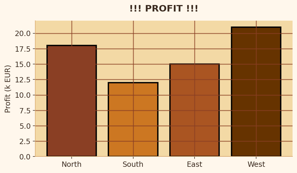
La décoration ne doit jamais entrer en concurrence avec les données.
import matplotlib.pyplot as plt

regions = ["North", "South", "East", "West"]
profit = [18, 12, 15, 21]

fig, ax = plt.subplots(figsize=(6.4, 3.8))
ax.set_facecolor("#f3d9a5")
ax.bar(regions, profit, edgecolor="black", linewidth=2)
ax.grid(True, axis="both")
ax.set_title("!!! PROFIT !!!")
ax.set_ylabel("Profit (k EUR)")
plt.show()
import matplotlib.pyplot as plt

regions = ["North", "South", "East", "West"]
profit = [18, 12, 15, 21]

fig, ax = plt.subplots(figsize=(6.4, 3.8))
ax.bar(regions, profit)
ax.grid(True, axis="y")
ax.set_title("Profit by region")
ax.set_ylabel("Profit (k EUR)")
plt.show()
Règle 11 : Trop de catégories
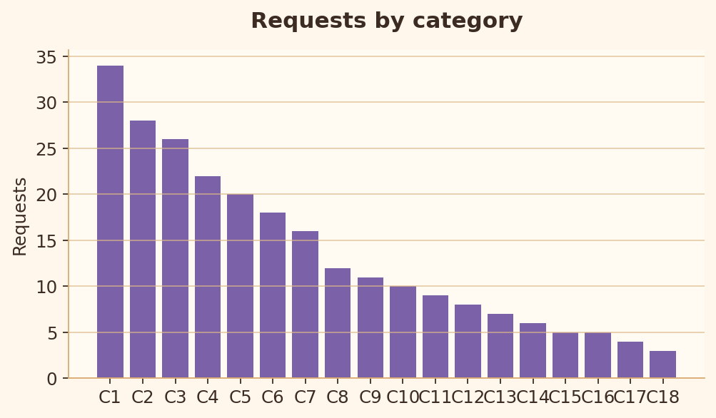
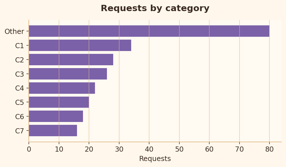
Trop de catégories rendent la comparaison lente et encombrée.
import matplotlib.pyplot as plt

categories = [f"C{i}" for i in range(1, 19)]
values = [34, 28, 26, 22, 20, 18, 16, 12, 11, 10, 9, 8, 7, 6, 5, 5, 4, 3]

fig, ax = plt.subplots(figsize=(6.4, 3.8))
ax.bar(categories, values)
ax.set_title("Requests by category")
ax.set_ylabel("Requests")
plt.show()
import matplotlib.pyplot as plt

categories = [f"C{i}" for i in range(1, 19)]
values = [34, 28, 26, 22, 20, 18, 16, 12, 11, 10, 9, 8, 7, 6, 5, 5, 4, 3]
top_labels = categories[:7] + ["Other"]
top_values = values[:7] + [sum(values[7:])]
pairs = sorted(zip(top_values, top_labels))

fig, ax = plt.subplots(figsize=(6.4, 3.8))
ax.barh([label for _, label in pairs], [value for value, _ in pairs])
ax.set_title("Requests by category")
ax.set_xlabel("Requests")
plt.show()
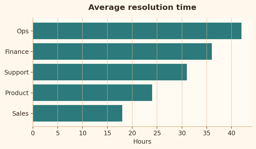
Règle 12 : Trier les barres catégorielles
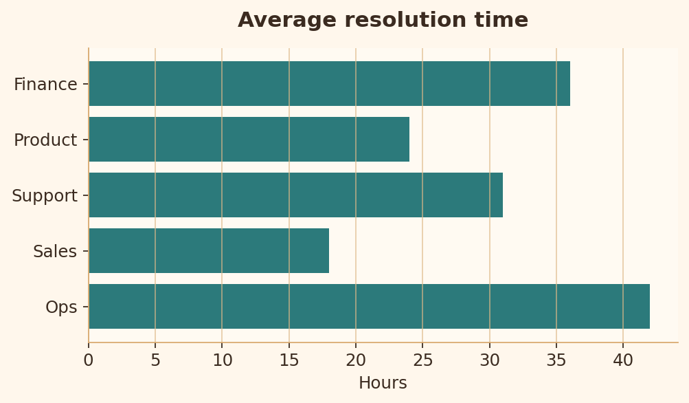
Des barres triées rendent le classement et la comparaison beaucoup plus rapides.
import matplotlib.pyplot as plt

teams = ["Ops", "Sales", "Support", "Product", "Finance"]
hours = [42, 18, 31, 24, 36]

fig, ax = plt.subplots(figsize=(6.4, 3.8))
ax.barh(teams, hours)
ax.set_title("Average resolution time")
ax.set_xlabel("Hours")
plt.show()
import matplotlib.pyplot as plt

teams = ["Ops", "Sales", "Support", "Product", "Finance"]
hours = [42, 18, 31, 24, 36]
pairs = sorted(zip(hours, teams))

fig, ax = plt.subplots(figsize=(6.4, 3.8))
ax.barh([team for _, team in pairs], [hour for hour, _ in pairs])
ax.set_title("Average resolution time")
ax.set_xlabel("Hours")
plt.show()
Règle 13 : Surimpression dans les nuages de points
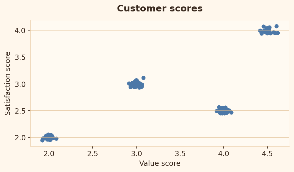
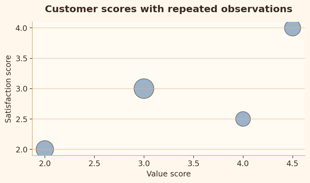
Des points répétés ou très denses doivent révéler la densité au lieu de la masquer.
import matplotlib.pyplot as plt
import numpy as np

rng = np.random.default_rng(42)
centers = np.array([[2, 2], [3, 3], [4, 2.5], [4.5, 4]])
points = np.repeat(centers, [35, 45, 25, 30], axis=0)
points = points + rng.normal(0, 0.04, size=(135, 2))

fig, ax = plt.subplots(figsize=(6.4, 3.8))
ax.scatter(points[:, 0], points[:, 1], s=28)
ax.set_xlabel("Value score")
ax.set_ylabel("Satisfaction score")
plt.show()
import matplotlib.pyplot as plt
import numpy as np

centers = np.array([[2, 2], [3, 3], [4, 2.5], [4.5, 4]])
counts = np.array([35, 45, 25, 30])

fig, ax = plt.subplots(figsize=(6.4, 3.8))
ax.scatter(centers[:, 0], centers[:, 1], s=counts * 18, alpha=0.55, edgecolor="black")
ax.set_xlabel("Value score")
ax.set_ylabel("Satisfaction score")
ax.set_title("Point size shows repeated observations")
plt.show()
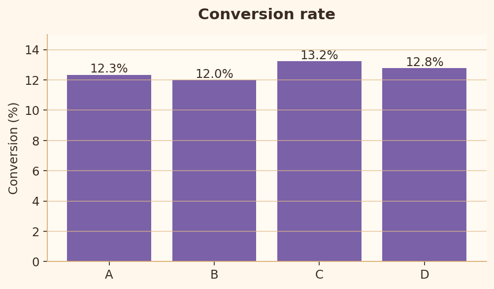
Règle 14 : Précision décimale
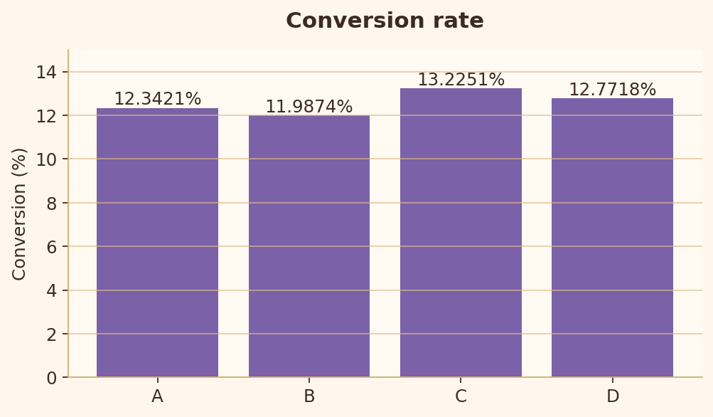
Les libellés doivent éviter les décimales inutiles qui ajoutent du bruit sans ajouter de sens.
import matplotlib.pyplot as plt

products = ["A", "B", "C", "D"]
conversion = [12.3421, 11.9874, 13.2251, 12.7718]

fig, ax = plt.subplots(figsize=(6.4, 3.8))
bars = ax.bar(products, conversion)
ax.bar_label(bars, fmt="%.4f%%")
ax.set_ylim(0, 15)
ax.set_ylabel("Conversion (%)")
plt.show()
import matplotlib.pyplot as plt

products = ["A", "B", "C", "D"]
conversion = [12.3421, 11.9874, 13.2251, 12.7718]

fig, ax = plt.subplots(figsize=(6.4, 3.8))
bars = ax.bar(products, conversion)
ax.bar_label(bars, fmt="%.1f%%")
ax.set_ylim(0, 15)
ax.set_ylabel("Conversion (%)")
plt.show()
Règle 15 : Formatage des dates
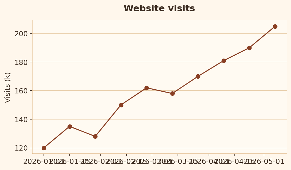
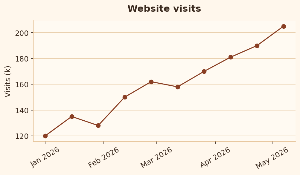
Les graduations temporelles doivent être formatées selon un intervalle facile à lire.
import matplotlib.pyplot as plt
import numpy as np

dates = [np.datetime64("2026-01-01") + np.timedelta64(i * 14, "D") for i in range(10)]
visits = [120, 135, 128, 150, 162, 158, 170, 181, 190, 205]

fig, ax = plt.subplots(figsize=(6.4, 3.8))
ax.plot(dates, visits, marker="o")
ax.set_title("Website visits")
ax.set_ylabel("Visits (k)")
plt.show()
import matplotlib.pyplot as plt
import matplotlib.dates as mdates
import numpy as np

dates = [np.datetime64("2026-01-01") + np.timedelta64(i * 14, "D") for i in range(10)]
visits = [120, 135, 128, 150, 162, 158, 170, 181, 190, 205]

fig, ax = plt.subplots(figsize=(6.4, 3.8))
ax.plot(dates, visits, marker="o")
ax.set_title("Website visits")
ax.set_ylabel("Visits (k)")
ax.xaxis.set_major_locator(mdates.MonthLocator())
ax.xaxis.set_major_formatter(mdates.DateFormatter("%b %Y"))
ax.tick_params(axis="x", rotation=30)
plt.show()
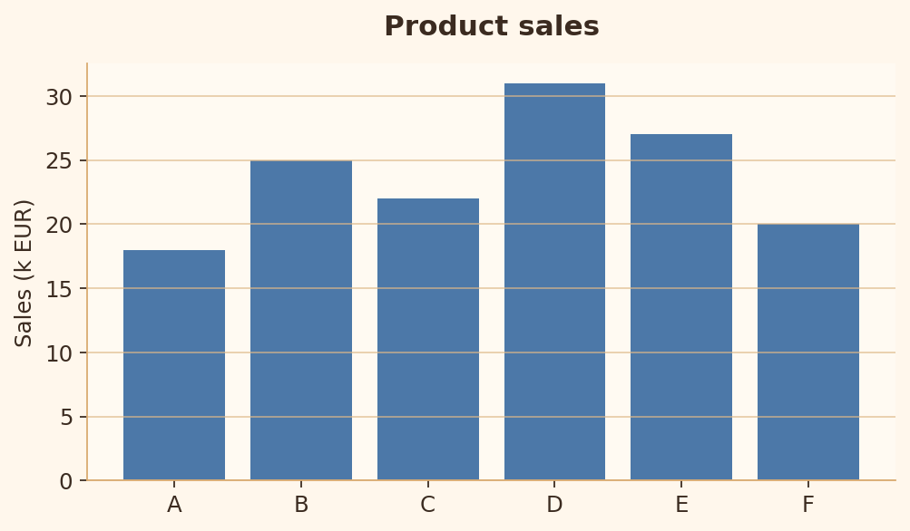
Règle 16 : Économie visuelle
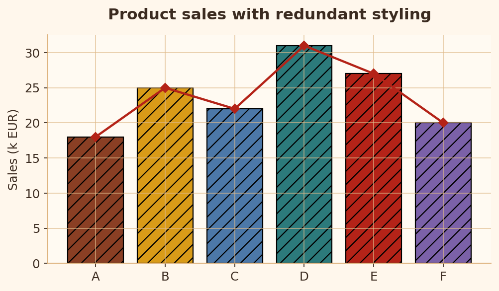
Il faut assez d’encodage visuel pour expliquer les données, sans ajouter de style redondant.
import matplotlib.pyplot as plt

products = ["A", "B", "C", "D", "E", "F"]
values = [18, 25, 22, 31, 27, 20]

fig, ax = plt.subplots(figsize=(6.4, 3.8))
ax.bar(products, values, hatch="//", edgecolor="black")
ax.plot(products, values, marker="D", color="red")
ax.grid(True, axis="both")
ax.set_title("Product sales with redundant styling")
plt.show()
import matplotlib.pyplot as plt

products = ["A", "B", "C", "D", "E", "F"]
values = [18, 25, 22, 31, 27, 20]

fig, ax = plt.subplots(figsize=(6.4, 3.8))
ax.bar(products, values)
ax.grid(True, axis="y")
ax.set_title("Product sales")
ax.set_ylabel("Sales (k EUR)")
plt.show()
Règles d’intégrité
Les règles 17 à 25 vérifient si le graphique évite les échelles, les encodages ou les comparaisons trompeuses.
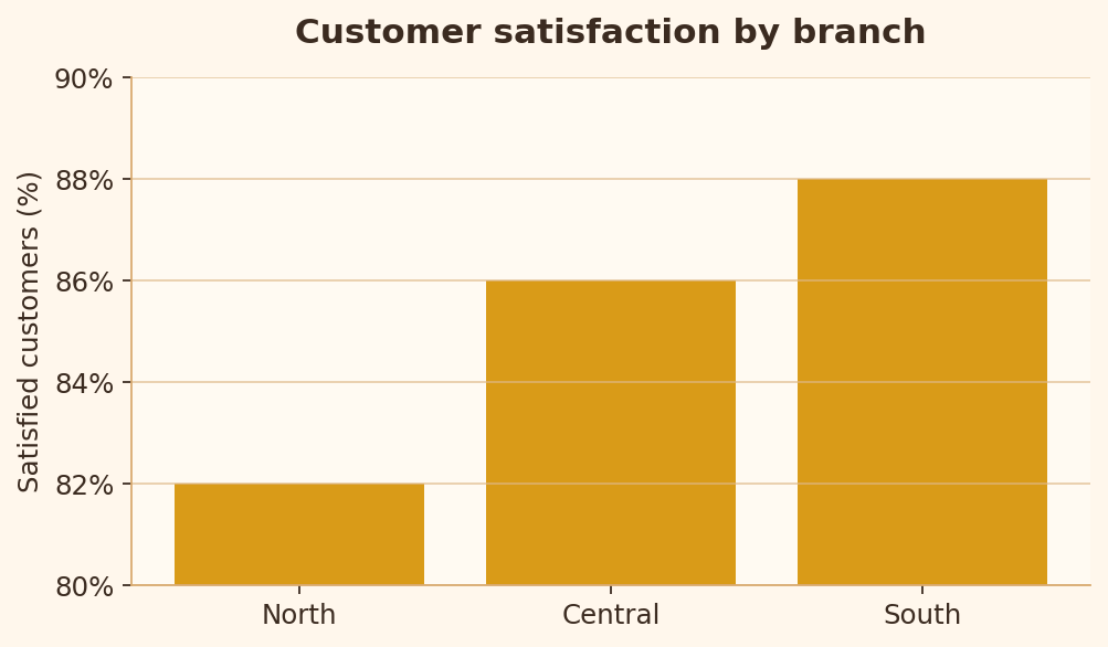
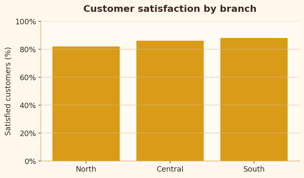
Règle 17 : Échelle appropriée
Avec des barres, une base tronquée peut exagérer de petites différences.
import matplotlib.pyplot as plt

branches = ["North", "Central", "South"]
satisfaction = [82, 86, 88]

fig, ax = plt.subplots(figsize=(6.4, 3.8))
ax.bar(branches, satisfaction)
ax.set_ylim(80, 90)
ax.set_title("Customer satisfaction by branch")
ax.set_ylabel("Satisfied customers (%)")
plt.show()
import matplotlib.pyplot as plt

branches = ["North", "Central", "South"]
satisfaction = [82, 86, 88]

fig, ax = plt.subplots(figsize=(6.4, 3.8))
ax.bar(branches, satisfaction)
ax.set_ylim(0, 100)
ax.set_title("Customer satisfaction by branch")
ax.set_ylabel("Satisfied customers (%)")
plt.show()
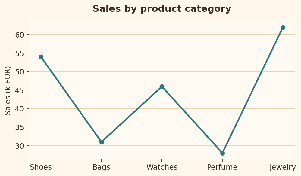
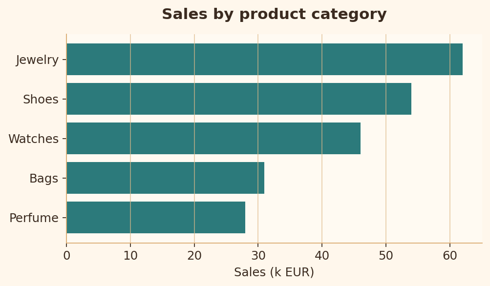
Règle 18 : Type de graphique adapté
Les comparaisons entre catégories se lisent mieux avec des barres qu’avec une ligne qui suggère à tort une séquence.
import matplotlib.pyplot as plt

products = ["Shoes", "Bags", "Watches", "Perfume", "Jewelry"]
sales = [54, 31, 46, 28, 62]

fig, ax = plt.subplots(figsize=(6.4, 3.8))
ax.plot(products, sales, marker="o")
ax.set_title("Sales by product category")
ax.set_ylabel("Sales (k EUR)")
plt.show()
import matplotlib.pyplot as plt

products = ["Shoes", "Bags", "Watches", "Perfume", "Jewelry"]
sales = [54, 31, 46, 28, 62]
pairs = sorted(zip(sales, products))

fig, ax = plt.subplots(figsize=(6.4, 3.8))
ax.barh([p for _, p in pairs], [s for s, _ in pairs])
ax.set_title("Sales by product category")
ax.set_xlabel("Sales (k EUR)")
plt.show()
Règle 19 : Qualité de la palette continue
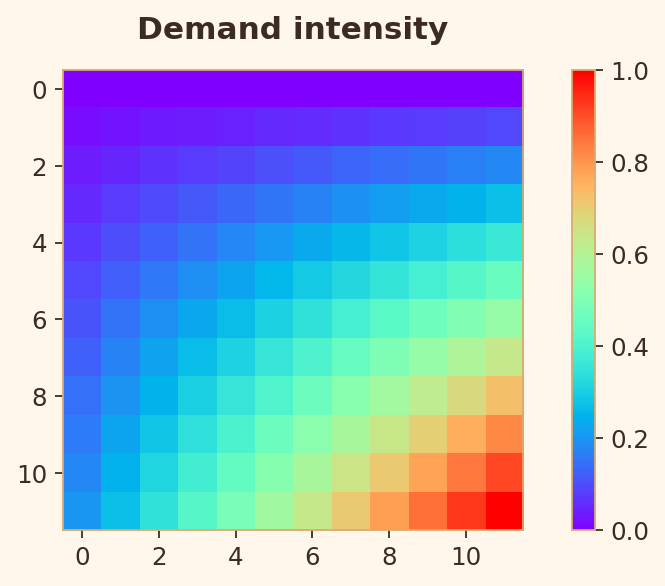
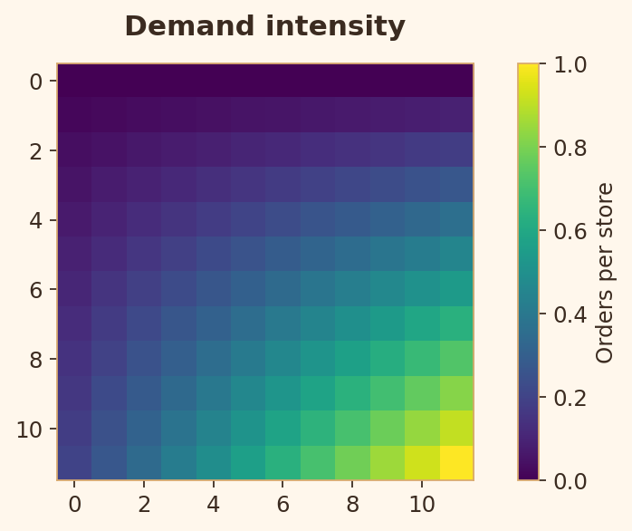
Une couleur continue doit s’appuyer sur une échelle perceptuelle et sur une barre de couleur explicitement étiquetée.
import matplotlib.pyplot as plt
import numpy as np

heat = np.outer(np.linspace(0, 1, 12), np.linspace(0.2, 1, 12))

fig, ax = plt.subplots(figsize=(6.4, 3.8))
image = ax.imshow(heat, cmap="rainbow")
ax.set_title("Demand intensity")
fig.colorbar(image, ax=ax)
plt.show()
import matplotlib.pyplot as plt
import numpy as np

heat = np.outer(np.linspace(0, 1, 12), np.linspace(0.2, 1, 12))

fig, ax = plt.subplots(figsize=(6.4, 3.8))
image = ax.imshow(heat, cmap="viridis")
ax.set_title("Demand intensity")
colorbar = fig.colorbar(image, ax=ax)
colorbar.set_label("Orders per store")
plt.show()
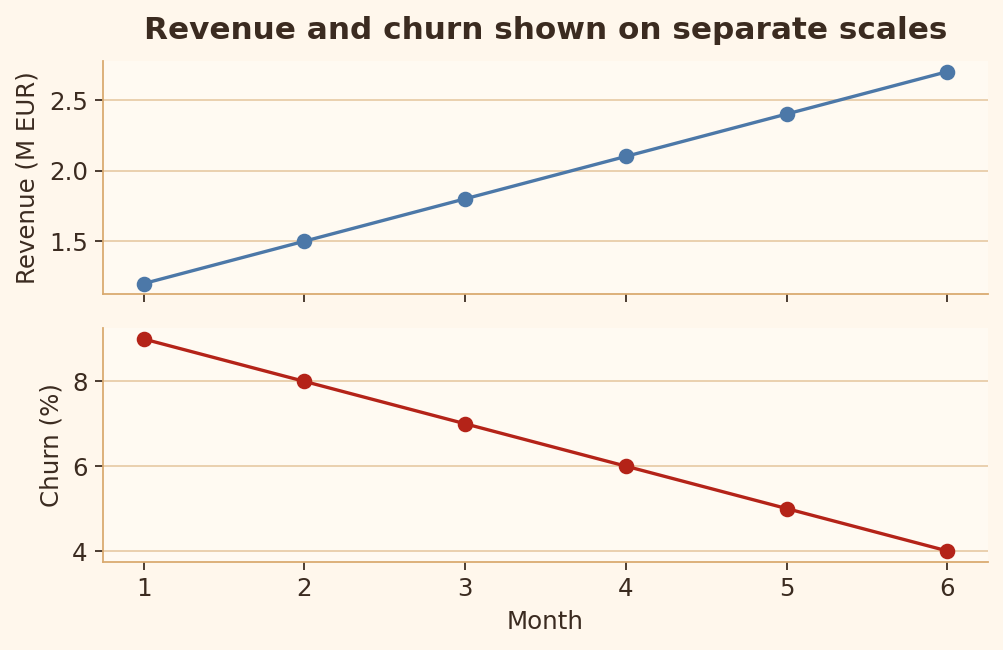
Règle 20 : Éviter les doubles axes
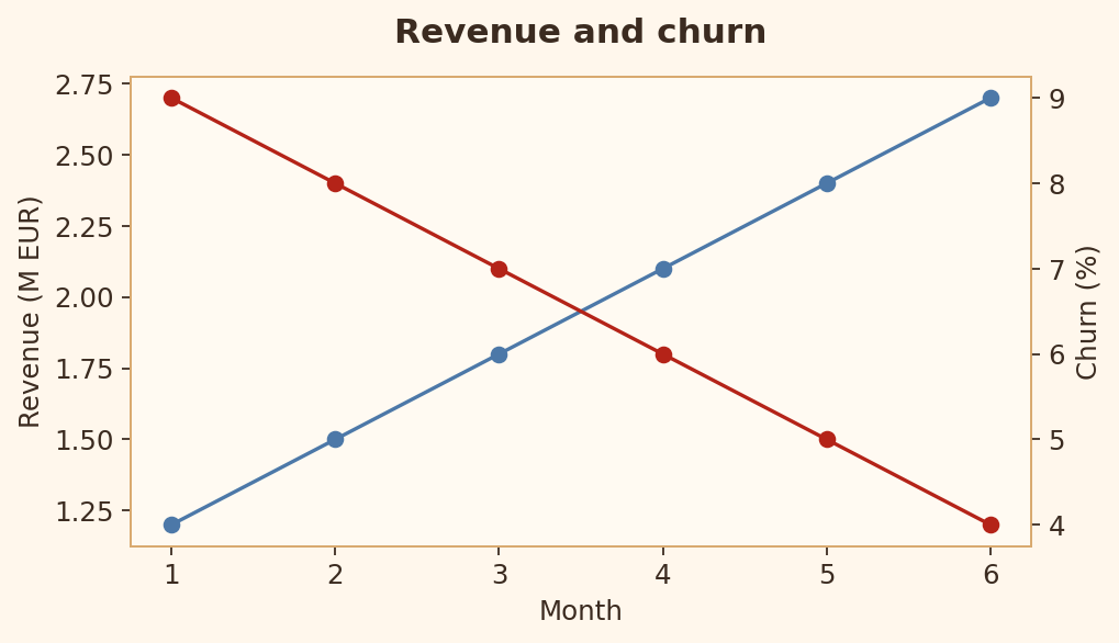
Les doubles axes peuvent suggérer des relations qui viennent surtout du choix d’échelle, et non des données.
import matplotlib.pyplot as plt

months = [1, 2, 3, 4, 5, 6]
revenue = [1.2, 1.5, 1.8, 2.1, 2.4, 2.7]
churn = [9, 8, 7, 6, 5, 4]

fig, ax1 = plt.subplots(figsize=(6.4, 3.8))
ax2 = ax1.twinx()
ax1.plot(months, revenue, marker="o", label="Revenue")
ax2.plot(months, churn, marker="o", color="red", label="Churn")
ax1.set_ylabel("Revenue (M EUR)")
ax2.set_ylabel("Churn (%)")
plt.show()
import matplotlib.pyplot as plt

months = [1, 2, 3, 4, 5, 6]
revenue = [1.2, 1.5, 1.8, 2.1, 2.4, 2.7]
churn = [9, 8, 7, 6, 5, 4]

fig, axes = plt.subplots(2, 1, figsize=(6.4, 4.2), sharex=True)
axes[0].plot(months, revenue, marker="o")
axes[0].set_ylabel("Revenue (M EUR)")
axes[1].plot(months, churn, marker="o", color="red")
axes[1].set_ylabel("Churn (%)")
axes[1].set_xlabel("Month")
plt.show()
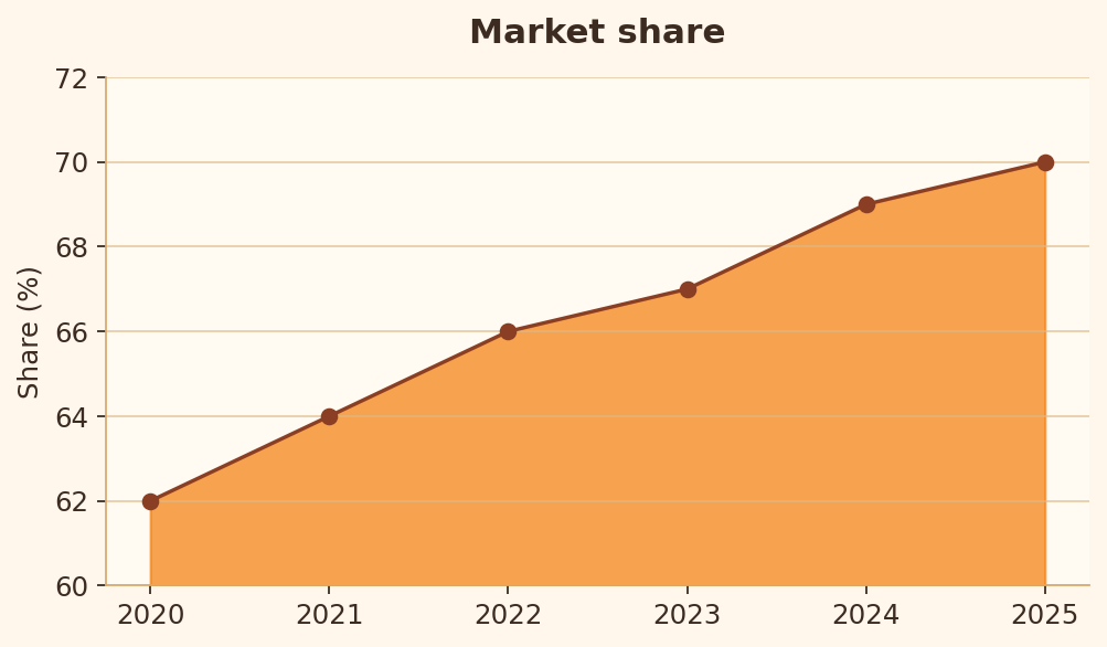
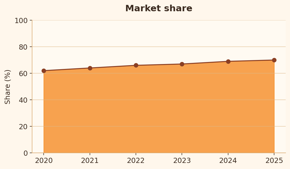
Règle 21 : Base des aires
Les aires remplies doivent reposer sur une base honnête, car la surface perçue a un sens.
import matplotlib.pyplot as plt

years = [2020, 2021, 2022, 2023, 2024, 2025]
share = [62, 64, 66, 67, 69, 70]

fig, ax = plt.subplots(figsize=(6.4, 3.8))
ax.fill_between(years, share, 60)
ax.plot(years, share, marker="o")
ax.set_ylim(60, 72)
ax.set_ylabel("Share (%)")
plt.show()
import matplotlib.pyplot as plt

years = [2020, 2021, 2022, 2023, 2024, 2025]
share = [62, 64, 66, 67, 69, 70]

fig, ax = plt.subplots(figsize=(6.4, 3.8))
ax.fill_between(years, share, 0)
ax.plot(years, share, marker="o")
ax.set_ylim(0, 100)
ax.set_ylabel("Share (%)")
plt.show()
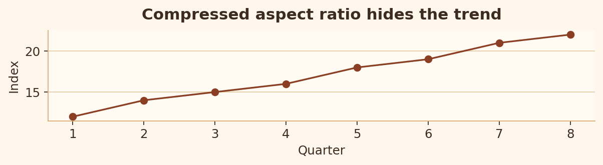
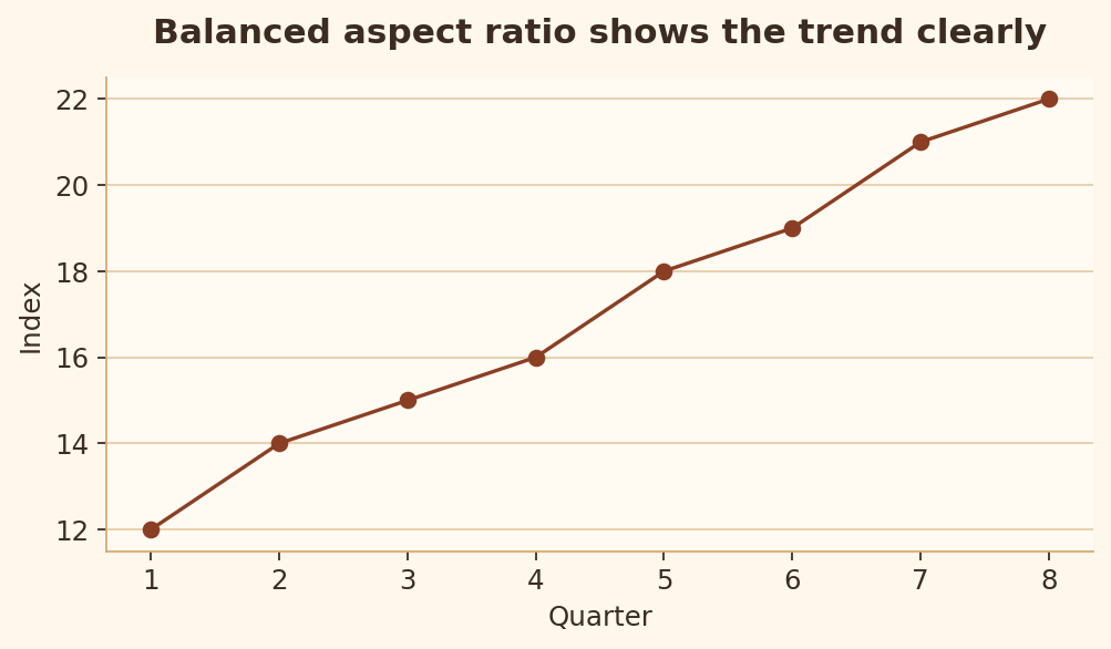
Règle 22 : Ratio d’aspect raisonnable
Des ratios d’aspect extrêmes peuvent aplatir ou dramatiser les tendances.
import matplotlib.pyplot as plt

quarters = [1, 2, 3, 4, 5, 6, 7, 8]
index = [12, 14, 15, 16, 18, 19, 21, 22]

fig, ax = plt.subplots(figsize=(7.8, 2.2))
ax.plot(quarters, index, marker="o")
ax.set_title("Compressed'aspect ratio hides the trend")
plt.show()
import matplotlib.pyplot as plt

quarters = [1, 2, 3, 4, 5, 6, 7, 8]
index = [12, 14, 15, 16, 18, 19, 21, 22]

fig, ax = plt.subplots(figsize=(6.4, 3.8))
ax.plot(quarters, index, marker="o")
ax.set_title("Balanced'aspect ratio shows the trend clearly")
plt.show()
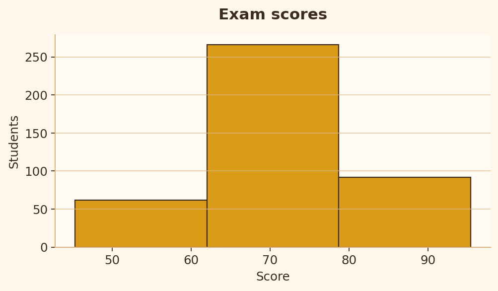
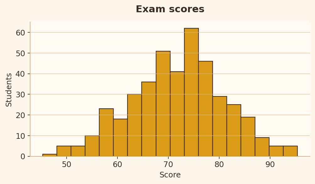
Règle 23 : Qualité des classes d’histogramme
Un histogramme a besoin d’un nombre de classes suffisant pour révéler la forme de la distribution sans créer de bruit.
import matplotlib.pyplot as plt
import numpy as np

rng = np.random.default_rng(42)
scores = rng.normal(72, 9, 420)

fig, ax = plt.subplots(figsize=(6.4, 3.8))
ax.hist(scores, bins=3)
ax.set_title("Exam scores")
ax.set_xlabel("Score")
ax.set_ylabel("Students")
plt.show()
import matplotlib.pyplot as plt
import numpy as np

rng = np.random.default_rng(42)
scores = rng.normal(72, 9, 420)

fig, ax = plt.subplots(figsize=(6.4, 3.8))
ax.hist(scores, bins=18)
ax.set_title("Exam scores")
ax.set_xlabel("Score")
ax.set_ylabel("Students")
plt.show()
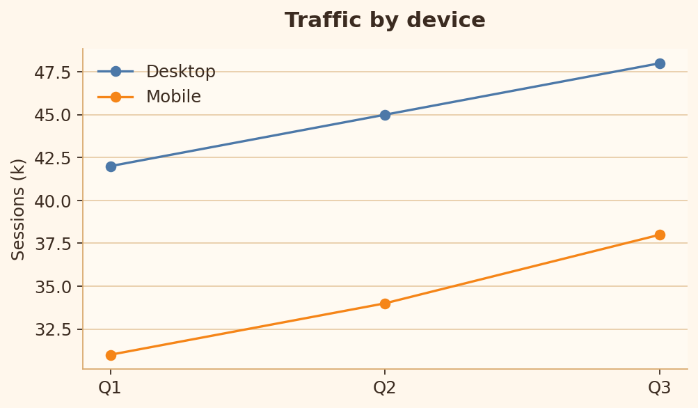
Règle 24 : Cohérence des couleurs catégorielles
Une même catégorie doit garder la même couleur dans tout le graphique.
import matplotlib.pyplot as plt

quarters = ["Q1", "Q2", "Q3"]
desktop = [42, 45, 48]
mobile = [31, 34, 38]

fig, ax = plt.subplots(figsize=(6.4, 3.8))
ax.plot(quarters, desktop, marker="o", color="blue", label="Desktop")
ax.plot(quarters, mobile, marker="o", color="orange", label="Mobile")
ax.scatter(["Q2"], [45], color="orange", s=90)
ax.scatter(["Q2"], [34], color="blue", s=90)
ax.legend()
plt.show()
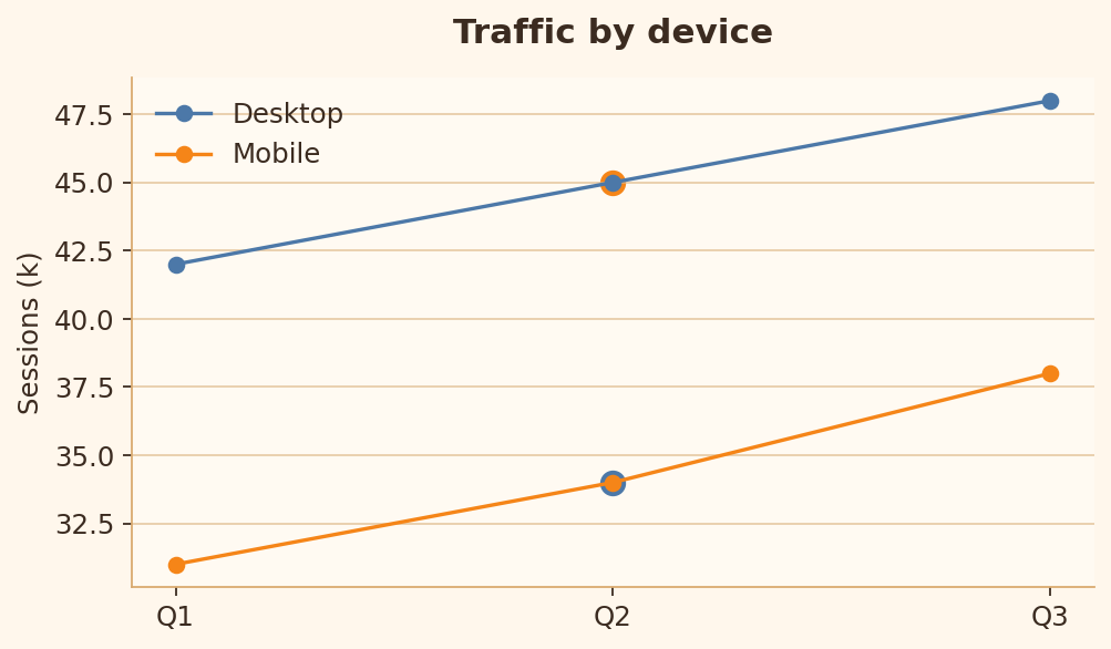
import matplotlib.pyplot as plt

quarters = ["Q1", "Q2", "Q3"]
desktop = [42, 45, 48]
mobile = [31, 34, 38]

fig, ax = plt.subplots(figsize=(6.4, 3.8))
ax.plot(quarters, desktop, marker="o", color="blue", label="Desktop")
ax.plot(quarters, mobile, marker="o", color="orange", label="Mobile")
ax.legend()
ax.set_title("Traffic by device")
ax.set_ylabel("Sessions (k)")
plt.show()
Règle 25 : Référence zéro pour les valeurs divergentes
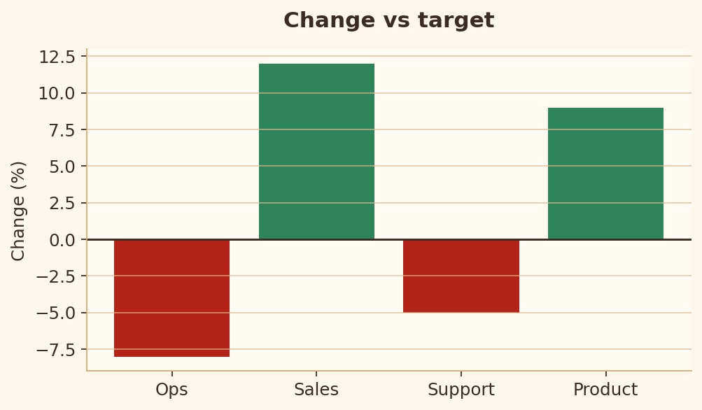
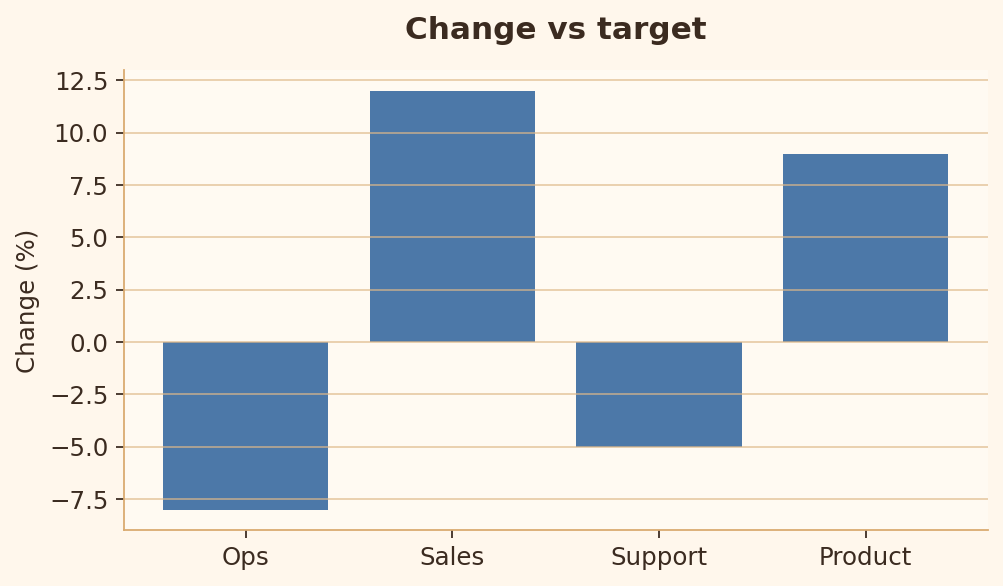
Les valeurs positives et négatives ont besoin d’une référence zéro clairement visible.
import matplotlib.pyplot as plt

departments = ["Ops", "Sales", "Support", "Product"]
delta = [-8, 12, -5, 9]

fig, ax = plt.subplots(figsize=(6.4, 3.8))
ax.bar(departments, delta)
ax.set_title("Change vs target")
ax.set_ylabel("Change (%)")
plt.show()
import matplotlib.pyplot as plt

departments = ["Ops", "Sales", "Support", "Product"]
delta = [-8, 12, -5, 9]
colors = ["#b42318" if value < 0 else "#2f855a" for value in delta]

fig, ax = plt.subplots(figsize=(6.4, 3.8))
ax.bar(departments, delta, color=colors)
ax.axhline(0, color="black", linewidth=1.2)
ax.set_title("Change vs target")
ax.set_ylabel("Change (%)")
plt.show()